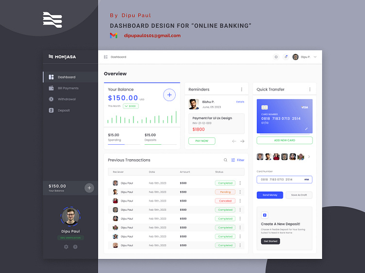
Dashboard Design for “Online Banking”
Hello everyone,
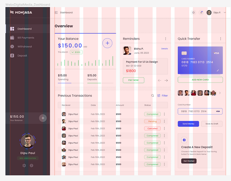
I'm excited to share that I have recently completed the initial design of our dashboard! It has been a creative journey, and I'm eager to gather your valuable feedback.
The dashboard is designed to provide a user-friendly and intuitive experience, allowing us to visualize and analyze data more effectively. I've put a lot of thought into the layout, color scheme, and overall user experience.
I would greatly appreciate it if you could take a few moments to review the dashboard. Your insights and suggestions are invaluable in helping us refine and improve the design before moving forward.
Please find the link to the dashboard design here: https://www.figma.com/file/T6Xnn0t9FvtrsczXIPTIQG/WebxDigitalMedia_04.06.2023?type=design&node-id=121%3A542&t=xUyazInGZkswr8WC-1
Want to collaborate? Email us: dipupaul0101@gmail.com
Thank you all in advance for your time and input. I'm looking forward to your discussion and working together to create an outstanding dashboard.