Kolonie - Ceramic Studio Landing Page
Project Overview
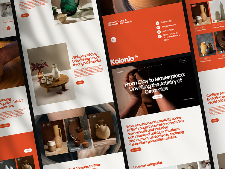
The Kolonie serves as a digital gateway to the studio's world of exquisite ceramic art. It aims to captivate visitors with a fresh and unique layout, while the dominant orange color creates a sense of vibrancy and energy.
The Concept
Inspired by the studio's dedication to craftsmanship, I developed a design concept that fuses elegance with modernity. The fresh layout and pop of orange were chosen to evoke a sense of creativity and enthusiasm, inviting visitors to explore the studio's ceramic creations.
User Interface & Iteration
The user interface design reflects the studio's artistic approach. The unique layout showcases the ceramic pieces as focal points, allowing their intricate details to shine. The dominant orange color adds a bold and energetic touch, while the typography selection conveys elegance and modernity.
Throughout the design process, I iterated and refined the layout, colors, and typography to ensure a cohesive and visually appealing composition. User feedback played a vital role in shaping the final design, resulting in an engaging and visually impactful landing page.
Conclusion
Designing the Kolonie Ceramic Studio landing page was a fulfilling experience, combining my passion for UI/UX design with the beauty of ceramics. I look forward to future collaborations where I can bring fresh and unique designs to life.
We are available for your awesome projects!
Affordable and satisfaction guaranteed. Just shoot us an email at info@slabdsgn.com and let's chat on Skype
------------------------------------
Check our product 🚀
Creative Market | Envato Elements | UI8
Follow us for more cool stuff ✨


