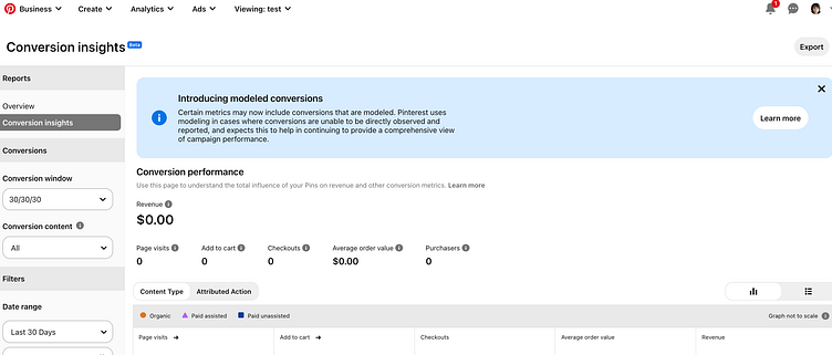
Campaign process
Problem: Product designers and engineers provided feedback on revising the confusing conversion campaign process. Previous workflow (last image) assumed users could see all colors and was cluttered.
The addition of a conversion access token, to limit/secure access, was developed with research team's feedback.
Result: less confusion in the early stages of campaign creation and more guidance on tracking events/user activity. This third-party influencer's video has more details: https://www.youtube.com/watch?v=hZsN0-7WIwU&t=101s
More by UX Content Project Management: Jo Ebizie View profile
Like


