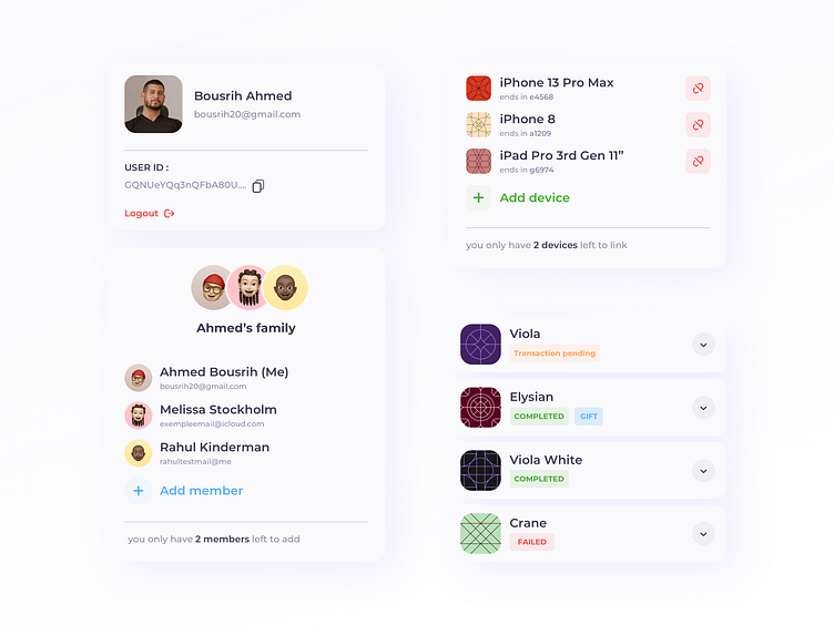
Pluto Repo - Profil Page Cards
Hi there community,
Here's a close look to the cards I designed for the profil page.
I chose a minimalistic approach. The whole profil page looks minimal and action only happens inside the cards.
So to the users eyes, he can only focus on one thing at a time.
For example, at first glance when the user enters the profil, the whole page will look so minimal and clean and easy to read.
When the user identifies what he needs from the appealing and big headers he then focus on that specific card which has concluded all the necessary information.
This was my approach in cards design. Hope you like it, and if you do a like would deff help!
Wanna work together? I'm funny btw, DM me on Twitter or shoot me an email at bousrih20@gmail.com
More by Ahmed Bousrih View profile
Like
