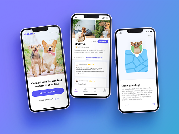
4Paws - Dog Walking App
The problem 📝
Dog owners need help caring for and walking their dogs. One of the main problems with current online solutions is for dog owners to trust that their pet is in good hands. Many users also complain that current apps are hard to navigate.
The solution💡
4Paws is a user-friendly platform that provides dog walking services to busy local dog owners. With a clean interface and features that prioritize the dog's welfare, such as trusted walkers and flexible scheduling, 4Paws offers a convenient and reliable solution for pet care needs.
Talking to users
To understand the pain points I interviewed five dog owners. According to the information I collected, I built a user persona. They are representative of potential users.
What is already out there?
Numerous applications for dog walking and pet care exist, and a few have achieved significant retention. However, my research reveals that these apps share a common weakness they are difficult to navigated offering poor user experience.
How can users browse and book walkers with ease
I created two user flows one for the onboarding process and another one for booking a walker, as they are the most important aspects of the app. For onboarding, I aimed for a smooth and positive first experience for users. As for booking a walker, I prioritized minimizing the time required and ensuring a good user experience.
Getting all the good and bad ideas out
I created multiple quick sketches for the different pages in the app. This helped me visualize various layout possibilities without spending too much time on the fine details.
Visualizing how the app is going to look like and work
Testing what's working and what isn't
I conducted user testing with a variety of dog owners who were potential users of the app. They were asked to complete two main tasks: onboarding the app and booking a walk. Throughout the process, I asked them to share their thoughts and recorded areas where improvements could be made.
Change filter icon
It took users a while to realize they could filter options. I adjusted the filter icon and tested it again.
Payment info
Users were confused as to which payment method the app was using. I adjusted the design to show the card on file before completing the booking.
Booking slots
After testing both formats, the second one performed better as users preferred seeing all available time slots at once instead of having to scroll through them.
Final Designs and features
Find nearby walkers
Users can easily browse walkers and filter based on their preferences including price range, certification, rating and more.
Review walkers profile
Each dog walker has a profile where users can review their rating, certifications, pricing, and confirm if their services align with their dog's needs.
Easy booking process
Booking services requires just a few clicks. See walkers availability, select date and time and book.
Track service
The app allows you to track your dog's services and organizes upcoming appointments with convenient reminders, as well as providing easy access to reach out to your dog walkers.
Takeaways
✔️ Keeping up with the latest design trends and iOS guidelines was important to ensure that my app design was modern, relevant, and met the standards of the app market. Given that the market already has multiple apps I wanted to make sure mine standout by it's appealing design and ease of use.
✔️ Being open to feedback from users and team members, was crucial to the success of my iOS app design. I gathered feedback throughout the design process and incorporated it into my design to ensure that the final product met the needs and expectations of all users.


