GIF for Sport App
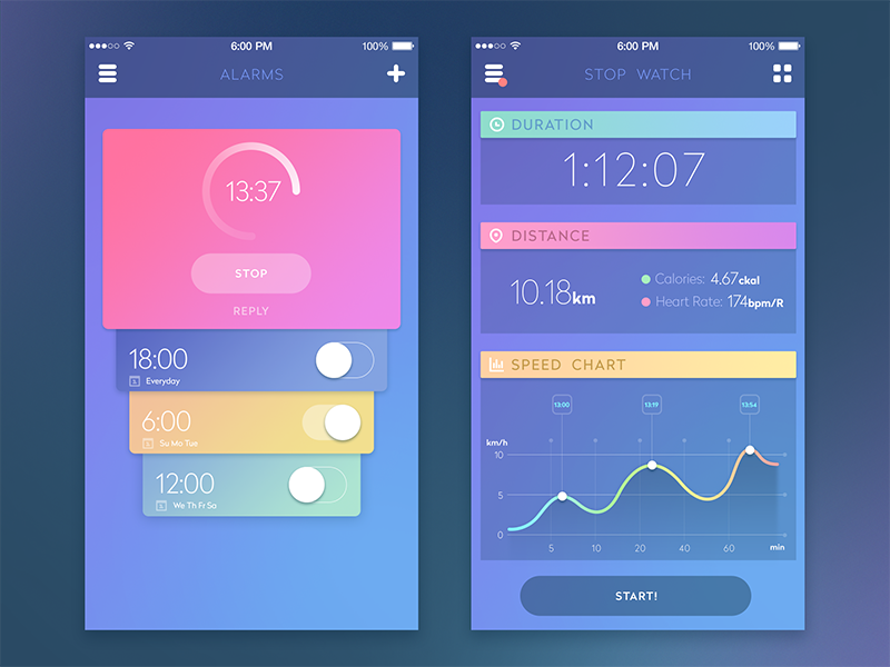
Last week you saw my Sport App UI. Today I want to share with you some of its interactions in GIF animations. The structure is very simple: it consists of a side menu and content. Menu moves from left to right to show all the app sections. The main idea is to make some "rubber effect" for the content when the side menu opens. It serves one goal — to make all content details visible even when menu is open on the screen. Like I said before colour palette is all about fresh and bright scheme to motivate users to act. Thanks for watching, sport forever! And don't forget to tap the letter "L" if you like this work or sport in general ;)
Short promo info. As you can see I've been publishing shots on dribbble for two years as part of the Tubik Studio team. This is a team of talented UI/UX designers, illustrators and animators that I founded with Valentyn Khenkin in early 2013. We have finished more than 100 projects since then in different fields and areas. Visit our page, read our posts to see or process and philosophy. BTW we are looking for new talented designers to join our family at Dnipro office. Have a good and productive week you all. Peace.

