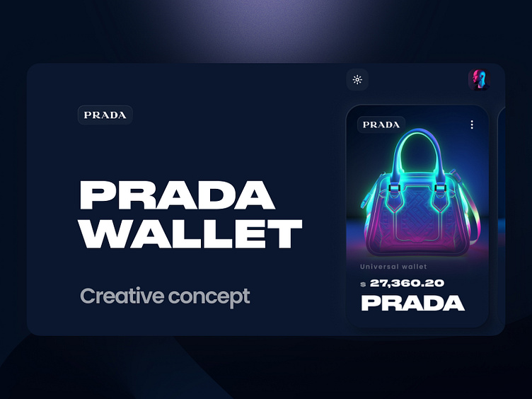
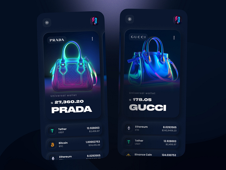
Prada and Gucci Fashion Brand New Creative Design Neon Concept
When I started working on the design of the Prada handbags' app page, my goal was to create a captivating and innovative interface that would highlight the brand's luxury and uniqueness. I began by thoroughly researching the Prada brand, its values, and visual identity to capture its distinct aspects and reflect them in the design.
The next step was developing a design concept in a neon style. I chose this style because it stands out in a cool way and grabs attention amidst other projects. The neon style perfectly suits the web3 environment and emphasizes the app's innovative and modern character.
One of the main challenges was creating an aesthetically appealing interface that would also be user-friendly and intuitive. I opted for a combination of vibrant neon colors, eye-catching fonts, and bold graphics to create a unique visual atmosphere.
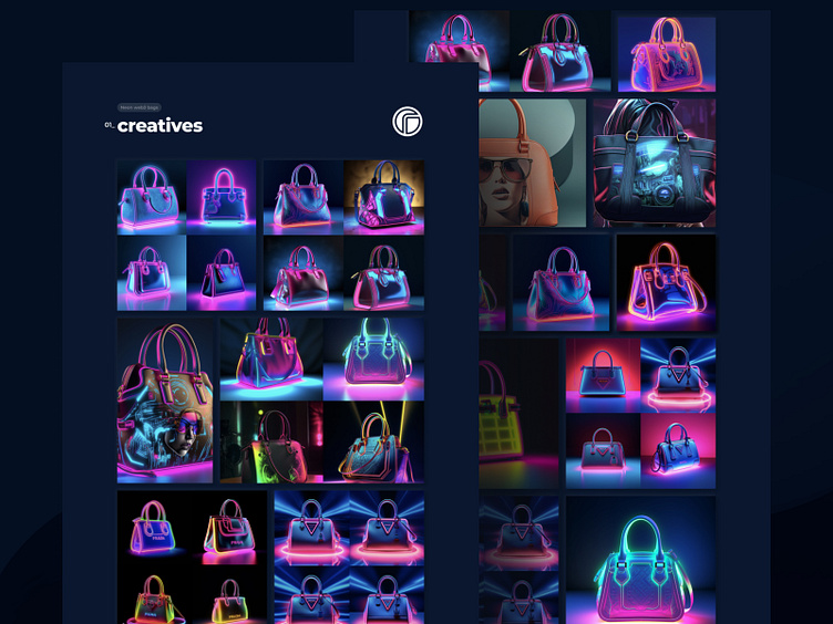
Visual content was also a crucial aspect. I carefully selected high-quality photos and videos that showcased the Prada handbags in a bright and enticing light. Presenting the products in the neon style added extra allure and uniqueness to them.
The new design perfectly captures the essence of Prada's luxury and innovation, standing out boldly in the crowd. After meticulously developing and implementing the new neon design, the results surpassed my expectations. It successfully sets Prada apart from the competition, drawing attention to the content and emphasizing its uniqueness. The new design not only makes a visual impact but also ensures intuitive and enjoyable user interaction.
And now the devil wears neon Prada 😎