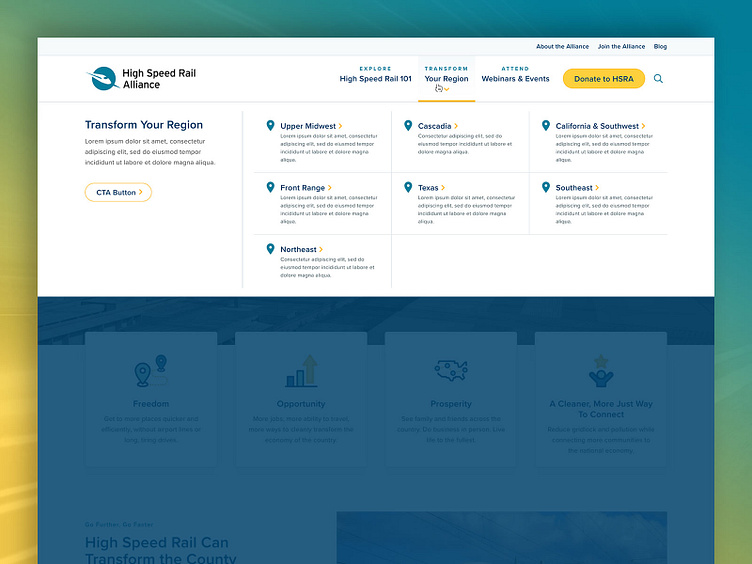
High Speed Rail Alliance - Website Redesign, Mega Menu
For the mega menu, it was very important for us to create a simple & cleanly-structured mega menu because they had a lot of info that they needed to convey under the "Transform Your Region" parent nav item. When the mega menu tray opens, I'm a huge fan of restating the parent level content in the far-left column, followed by the child nav items in a grid towards the right.
More by Orbit Media Studios View profile
Like
