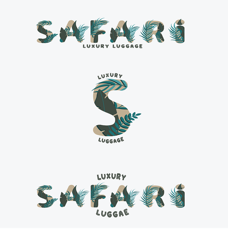
SAFARI
The process of creating the logo suite for Safari brand began with a thorough research and analysis of the brand's values, mission, and target audience. This helped me understand what the logo needed to convey visually and emotionally. After collecting this information, I began the ideation and sketching phase, exploring different concepts and directions for the logo. Once I had a few solid ideas, I created rough digital sketches using Adobe Illustrator. I then refined the sketches and presented them to the client for feedback. Based on the client's feedback, I continued to iterate and refine the concepts until we had a strong direction to move forward with. From there, I worked on creating variations of the chosen concept, exploring different color schemes, typography, and layouts. I presented the options to the client, and we worked together to finalize the logo design. Once the logo was finalized, I created a complete logo suite, including the primary logo, secondary logo, logo variations, and sub marks.
As part of the Safari brand design, I developed a tissue paper deliverable that embodies the brand's chic and luxurious aesthetic. To achieve this, I chose a high-quality tissue paper with a soft texture and a subtle sheen. I then created a custom pattern inspired by Safari's iconic logo and color palette, featuring an abstract pattern of palm fronds and luggage. The final result is a tissue paper that not only serves a practical purpose but also adds an extra touch of luxury and sophistication to the overall brand experience.
The design process for the brand pattern for Safari went through several stages:
Research and inspiration gathering: I started by researching safari and travel-related imagery, colors, and patterns. I also looked at the brand's existing design elements, such as the logo and typography, to ensure cohesion.
Sketching and ideation: Based on my research, I began sketching out different ideas for the pattern. I focused on incorporating elements such as animal prints, foliage, and earthy tones to reflect the brand's safari theme and luxury aesthetic.
Digital exploration: Using Adobe Illustrator, I created several digital versions of the sketches to experiment with different color schemes, shapes, and sizes. I played around with different arrangements of the elements until I found a pattern that felt balanced and visually appealing.
Refinement: After settling on a design, I continued to refine and tweak it until it met the brand's standards. I made sure that the pattern was scalable and versatile enough to be used across various touchpoints, such as packaging and promotional materials.
Finalization: Once the pattern was finalized, I created a style guide that outlined the color palette, typography, and usage guidelines for the pattern. This ensured consistency in its application across all brand touch points.
Overall, the design process for the brand pattern for Safari involved a combination of research, experimentation, and refinement to create a visually appealing and cohesive design that reflected the brand's luxury safari theme.
As part of the Safari brand design, I developed a tissue paper deliverable that embodies the brand's chic and luxurious aesthetic. To achieve this, I chose a high-quality tissue paper with a soft texture and a subtle sheen. I then created a custom pattern inspired by Safari's iconic logo and color palette, featuring an abstract pattern of palm fronds and luggage. The final result is a tissue paper that not only serves a practical purpose but also adds an extra touch of luxury and sophistication to the overall brand experience.
The design process for the Safari brand price tags began with understanding the brand's values, aesthetic, and target audience. The price tags needed to be visually appealing and consistent with the overall brand image while also conveying necessary information clearly. The first step was to create several design concepts that incorporated the brand's colors, typography, and logo. These concepts were presented to the client for feedback and input. Once a design concept was chosen, I moved on to the creation of the final design. The price tags were designed to be simple, elegant, and legible. The brand's typography was used throughout, with a focus on clear and easy-to-read fonts.
To ensure consistency across all price tags, a style guide was created outlining the color palette, typography, and layout guidelines. This guide was used throughout the design process to maintain consistency and ensure that all price tags were visually cohesive.
Once the designs were completed, they were reviewed and refined before being sent to the printers.


