Smartcat website design system. Typography
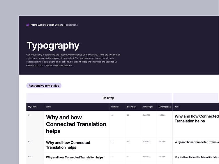
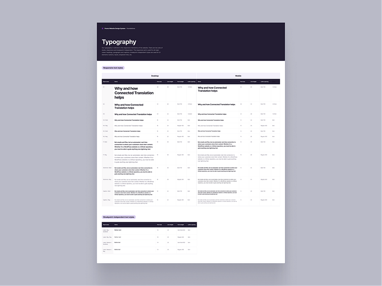
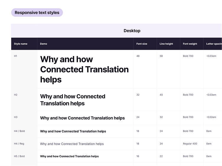
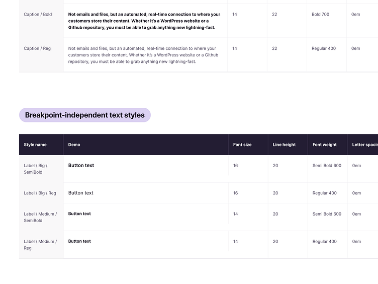
Our typography is tailored to the responsive mechanics of the website. There are two sets of styles: responsive and breakpoint-independent. The responsive set is used for all major cases: headings, paragraphs and captions. breakpoint-independent styles are used for UI elements: buttons, inputs, dropdown lists, etc.