Cigarette packaging design - Rusticum
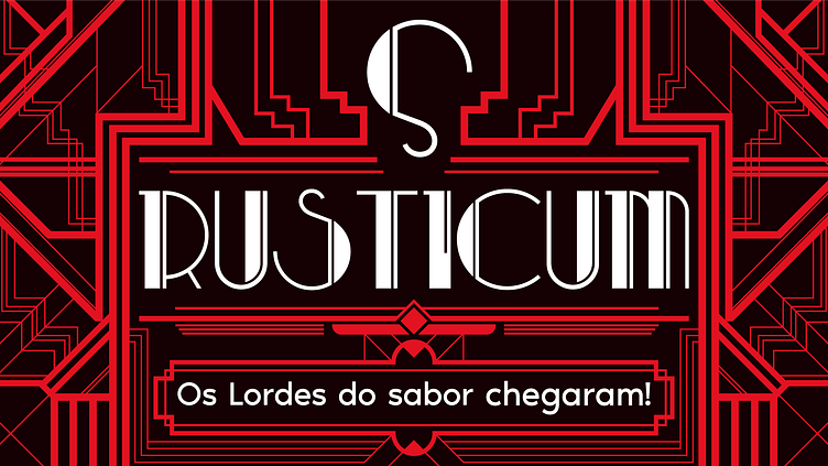
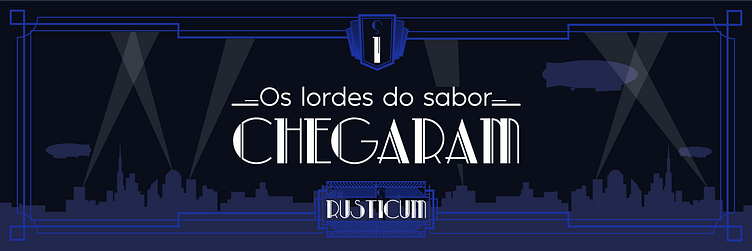
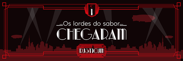
Rusticum - The Lords of Flavor
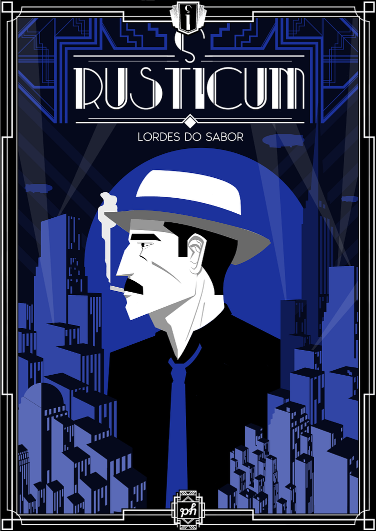
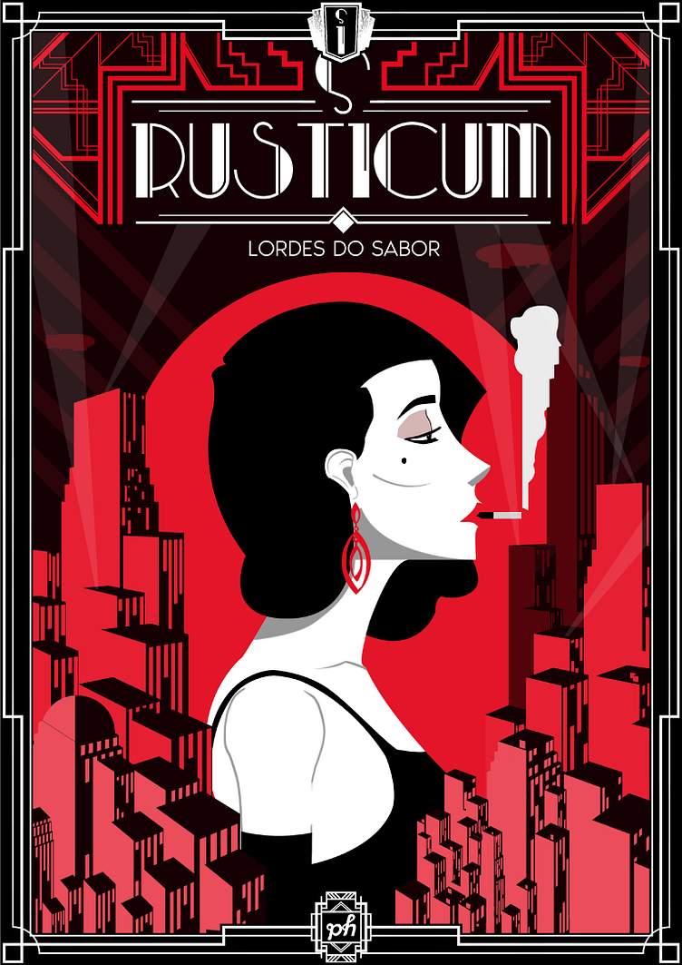
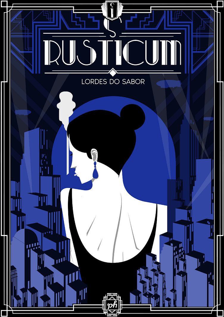
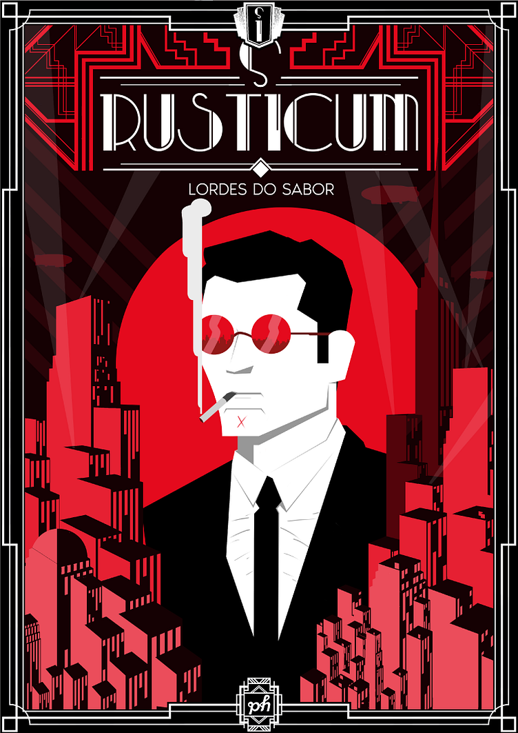
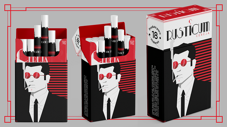
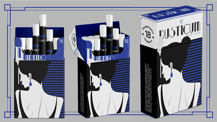
This project was born with the idea of creating a cigarette package that aligned Art Deco aesthetics with noir elements.
-
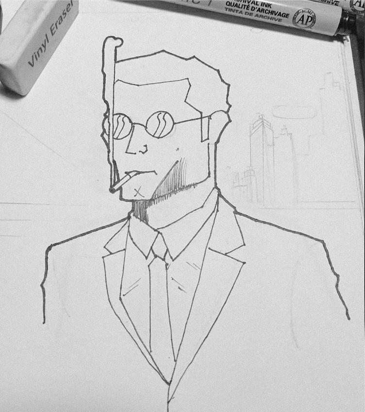
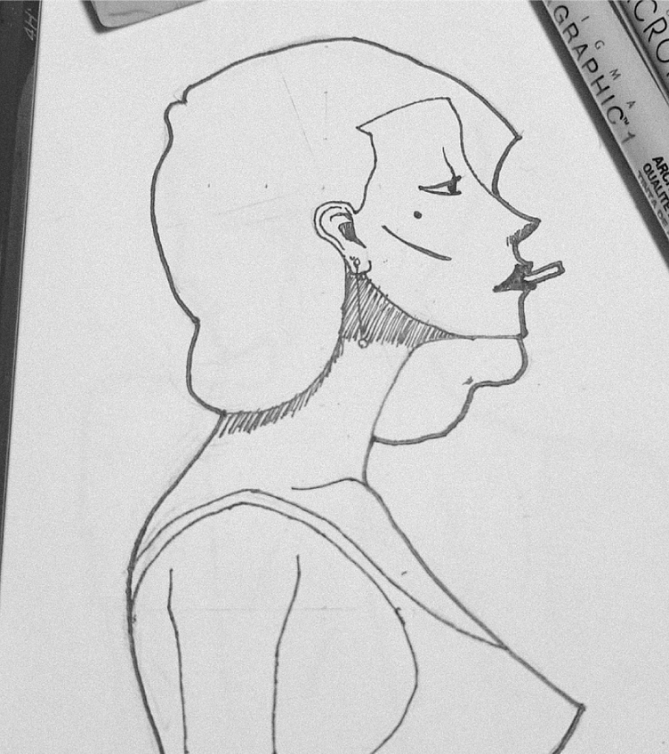
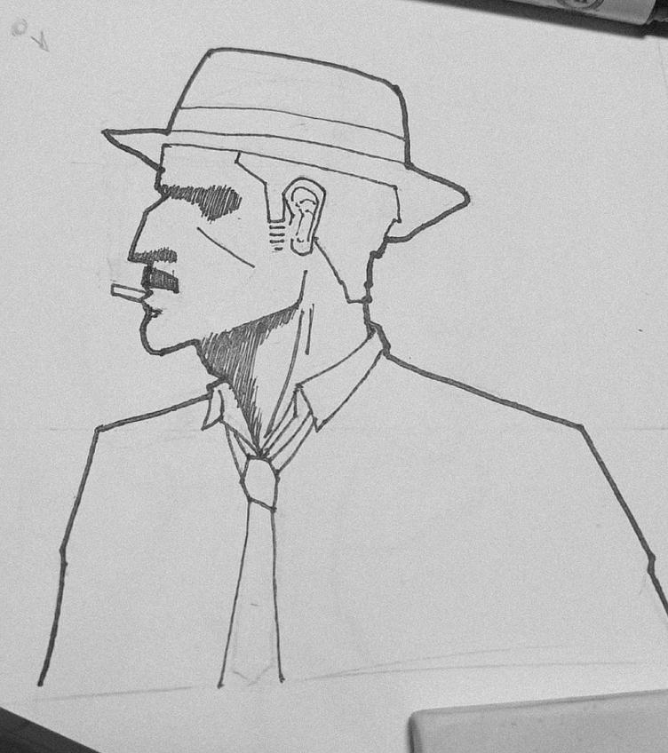
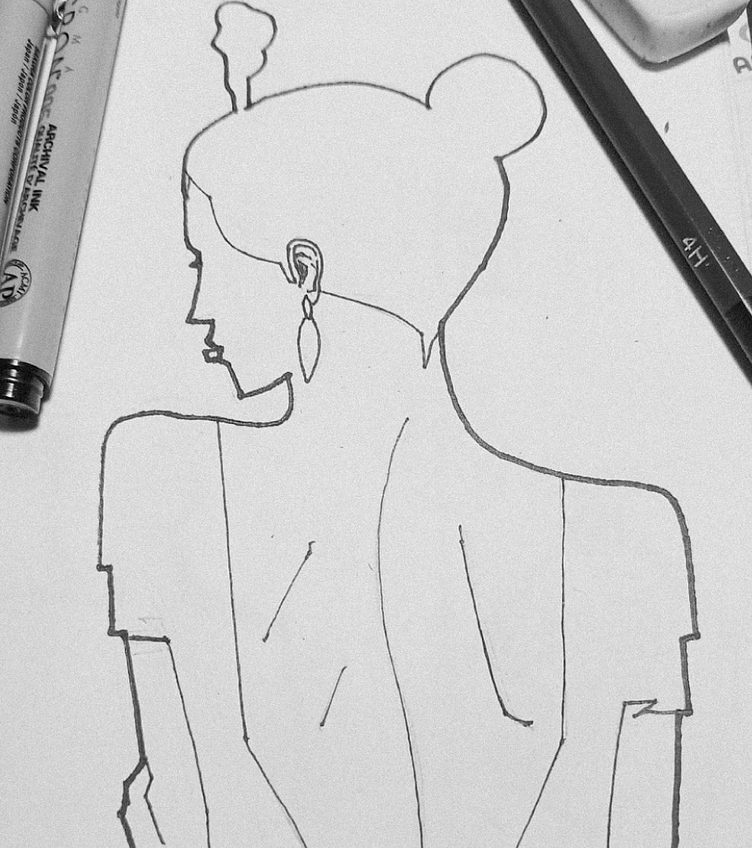
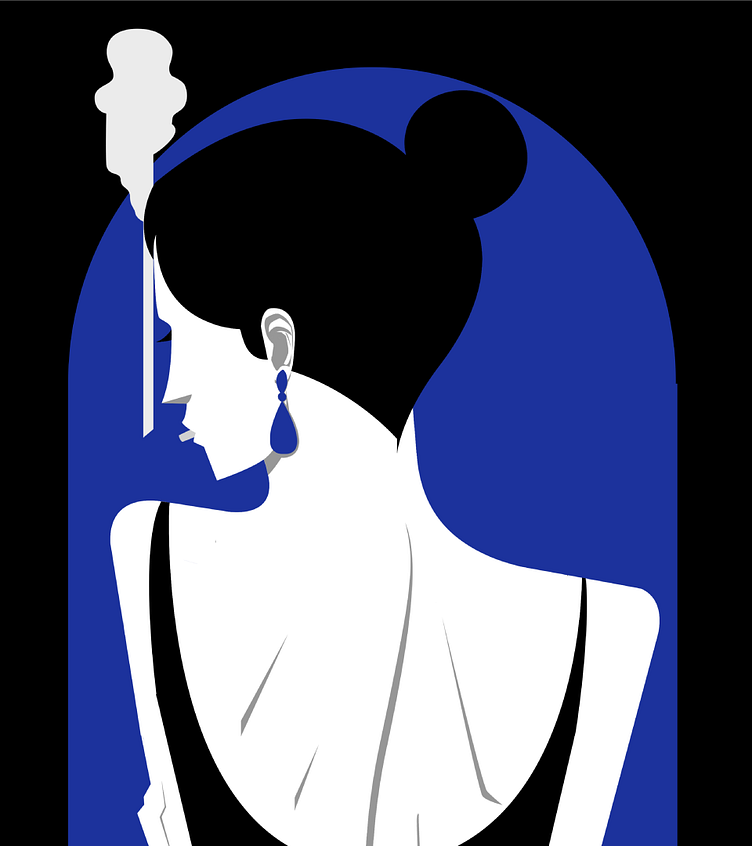
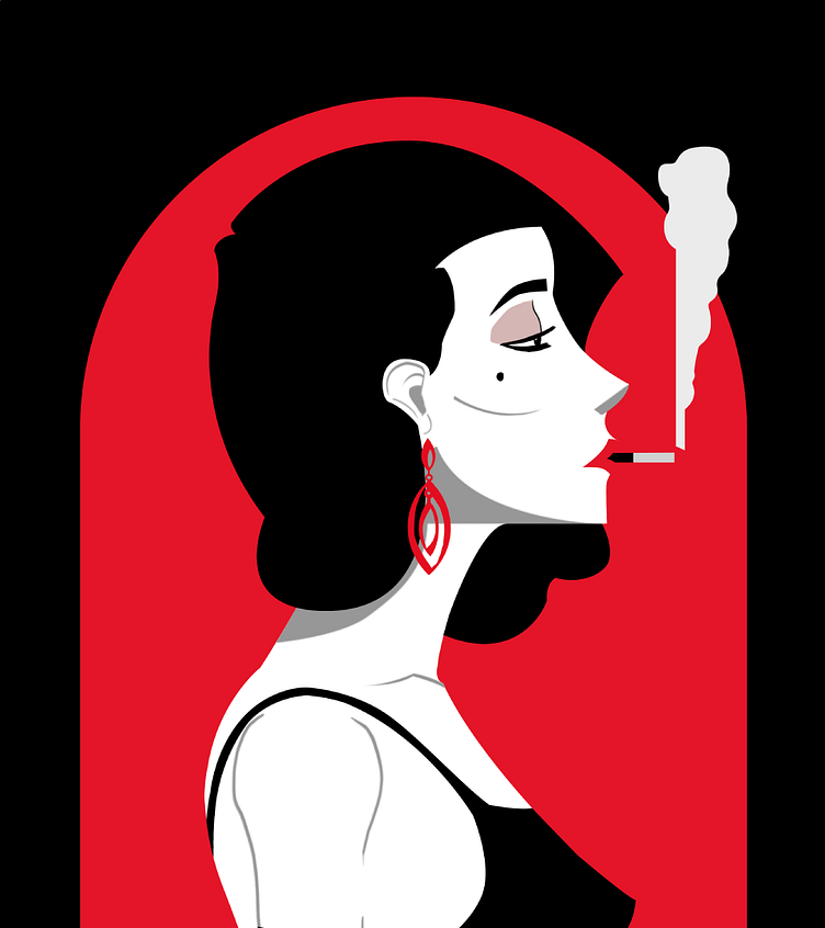
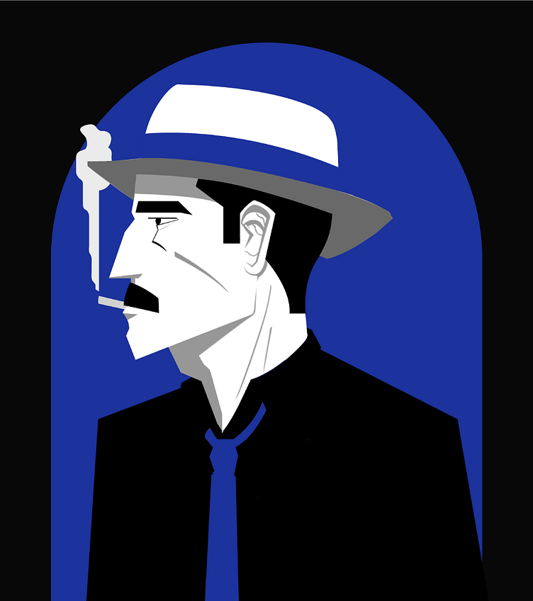
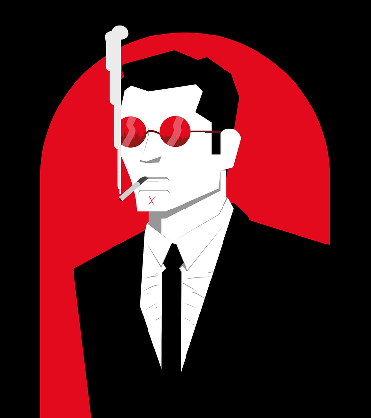
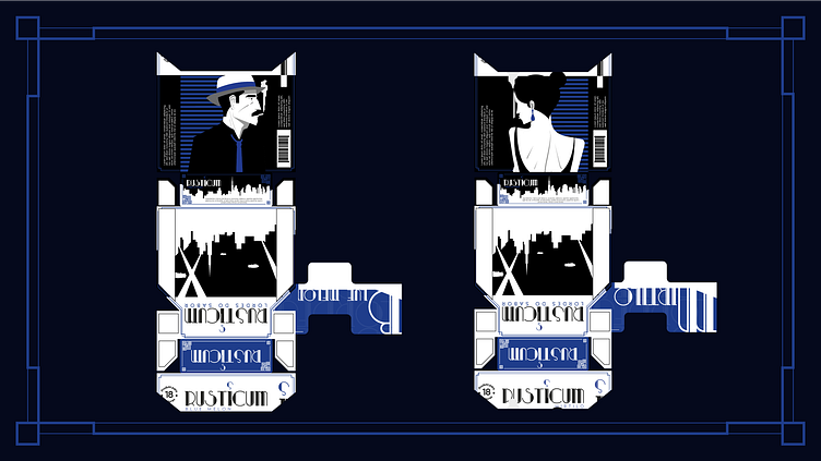
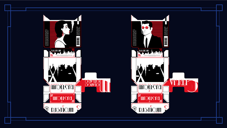
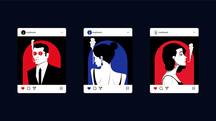
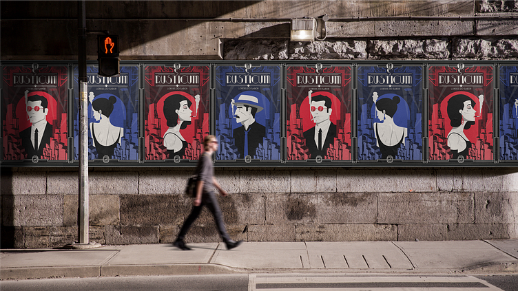
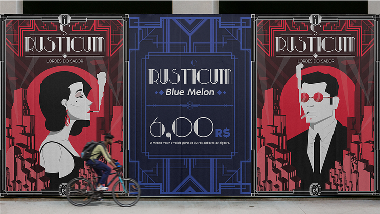
Firstly, the idea was to unite the two aesthetics, although they are already used together, I ended up deciding to focus on Art Déco in the sets, packaging elements and in the posters and banners. As for the noir style containing an air of mystery, I left it to the characters, for this reason the two that show their faces are on the side and the other characters hide their faces in some way.
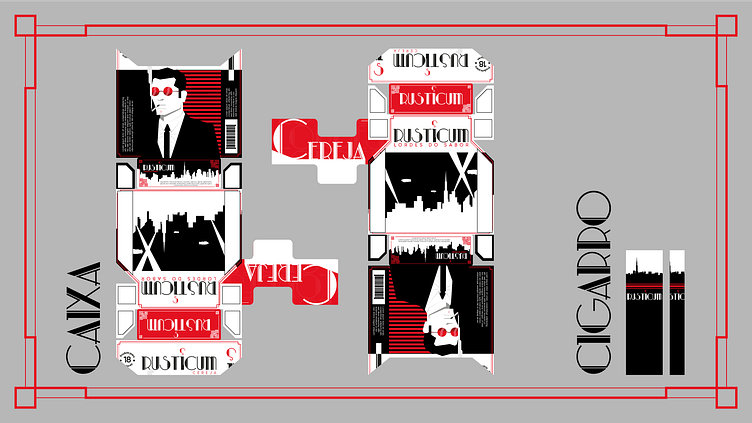
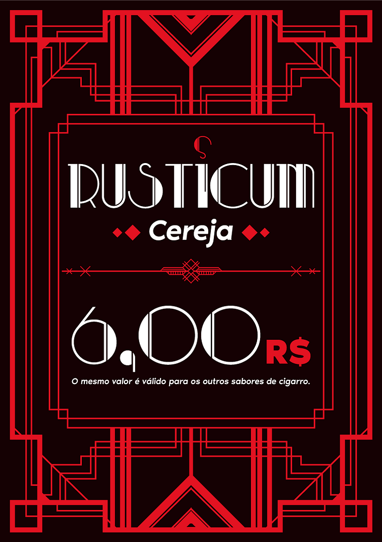
In addition to just being a union of styles, the project seeks to announce a new product on the market, a new brand of cigarette called Rusticum (this name was chosen due to the scientific name of one of the elements of the dry tobacco leaf, nicotine rusticum).
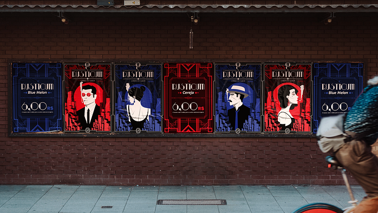
The use of several different characters and two predominant colors in the brand is due to the brand's focus on flavored cigarettes, thus aligning both the colors and the characters used in the packaging in order to better refer to the commercialized flavors.
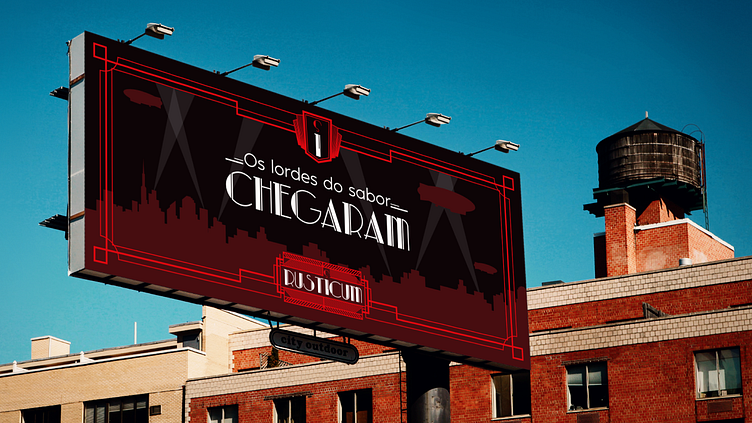
Therefore, other advertising pieces were developed to accompany the launch of the new product, such as posters, banners, billboards and social media focusing on the characters created for the brand. As the brand itself dates back to the 1920s, much of the advertising material focuses on print, to enjoy not only the look but the atmosphere of the time.