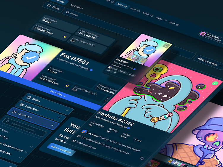
Illiquid Labs NFT Trading Platform
UX Cabin partnered with Illiquid Labs to completely overhaul the user experience and visual design of their peer-to-peer NFT trading platform.
This is an abbreviated case study. Read the full one here
Want to work with us?
Experience working with UX Cabin
Super straightforward.
One of the easiest experiences working with an external team
Liked how flexible our team was
Objectives
Make NFTs accessible to a wider audience with a flexible and easy-to-use platform
Become a one-stop-shop for all things NFT
Update the visual language of the brand to be modern, clean, and fun
Existing Application Audit
Listing your item for trade was quite technical, there was an opportunity to guide users through a flow
The filters in the trade listing were cumbersome to use
It was difficult to understand what users wanted to trade for (NFTs or Crypto)
The existing details for NFTs were limited, which made it difficult to submit a counteroffer
Design
There is this certain culture of clean UI and great UX on Terra and Cosmos chains. That was a very big emphasis for us with this protocol. UX Cabin exceeded our expectations!
Karma
Co-Founder, Illiquid Labs
The UX Cabin team expanded the color palette with primary, secondary, and neutral brand colors that would give Illiquid Labs more opportunity for expression. Additional colors were defined for buttons, statuses, empty states, and other interactive elements.
Inter was chosen as the typeface due to its modern look, the number of weights it offers, and its contrast to the pixelated look of the logo. The illustrations would remain in the current style and be drawn by the Illiquid Labs team.
Design System
A design system was created for brand styles, UI components, and icons. Each element was built to take full advantage of auto-layout, variants, and properties within Figma. This would ensure that the team wasn’t deviating from the established guidelines.
User Testing
The UX Cabin team conducted live user tests using Zoom and Figma. These sessions allowed the team to validate (or invalidate) specific tasks, actions, and workflows.
Findings
Participants found the newly designed interaction flows for listing items and submitting counter offers to be intuitive
Participants responded positively to the concept of private peer-to-peer NFT trades and appreciated the ability to communicate in-app.
Participants were not easily able to determine where they could view their outstanding trade offers.
Final Results
A fully responsive web NFT trading platform, a modern and scalable brand and design system, and a really happy client!
"I would 100% recommend UX Cabin. If someone is weighing up between going with a studio that hasn't been used before in their circle versus UX Cabin, it's a very, very easy choice."
Jack
Co-founder, Illiquid Labs
Want to work with UX Cabin?
we thrive on tackling complex, convoluted processes. We are experts in simplifying the complex and making simple, elegant solutions that are intuitive and easy to use.
If you'd like to see more, please check out our ✨ Portfolio ✨
What Industries do we work with?
🏦 Fintech
🪙 Crypto & Web3
🏢 Insurance
🏥 Healthcare
👩🏫 EdTech
✨ Consumer Apps
What Services do we offer?
🎨 UI/UX & Product Design
🔍 User Research & Testing
👩💻 Front-end Development
Can we work on a small engagement first?
📃 UX Audit - Easy fixes to vastly improve your product
🍱 Design System - Build products faster
🏃♂️ Design Sprint - Find the quickest path to your most viable solution
Enter your text here...


