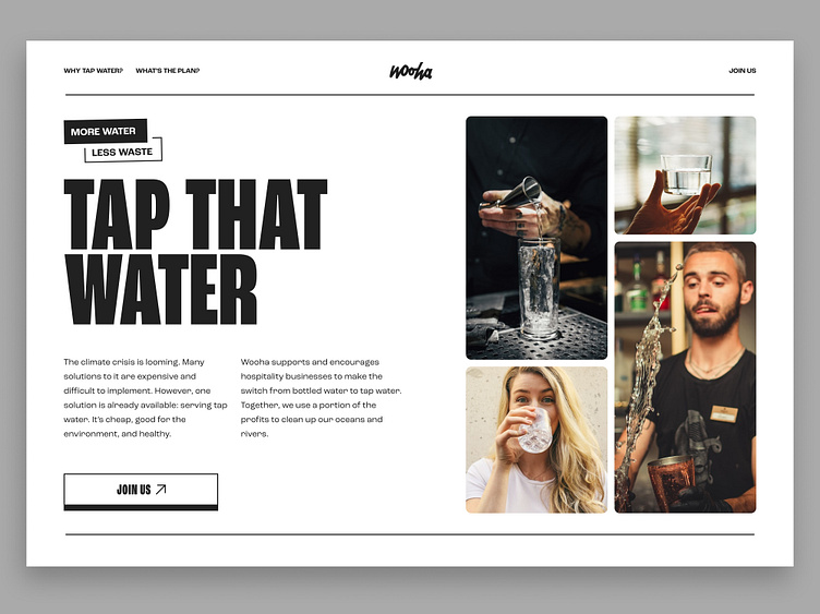
Charity landing page - water
A simple solution to a big problem deserves a simple visual approach with maximum stylistic effects.
Why black and white?
Wooha focuses on restaurants and bars, so we've decided to use the classic color scheme of waiters and elevate it in our brand.
Mail me for work: thomas@bousbous.be
Follow me on twitter.
Don't mind connecting on LinkedIn.
Check out our website: bousbous.be
More by Thomas Boussy View profile
Services by Thomas Boussy
Like
