Pastel soft color creative advert flyer print design
Crafting Visual Tranquility for Praktijk Marcelina - A Flyer Design by Thomas van der Kuijl
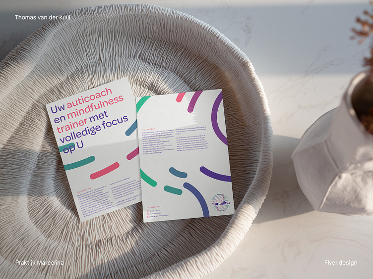
At Thomas van der Kuijl Design, I continually seek to create designs that speak volumes about a brand. Recently, I had the privilege of designing a flyer for Praktijk Marcelina, an autism coach and mindfulness trainer.
My intention with this project was to emulate the tranquility and calming environment Praktijk Marcelina provides to her clients. To capture this essence, I employed soft pastel colors - purples, pinks, and greens against a light background. Rounded shapes were also used throughout to promote a sense of calm and approachability.
The flyer design represents not just the brand, but also the wonderful journey of Praktijk Marcelina's proprietor. From her beginnings as a lower school teacher to her current role as an auticoach and mindfulness trainer, her story is inspirational. I believe the flyer design conveys this narrative effectively, all while maintaining an engaging, visually appealing aesthetic.
In designing the flyer for Praktijk Marcelina, I aimed to create a design that invites viewers to learn more about her services. It has been a fulfilling journey to bring Praktijk Marcelina's vision to life through my work at Thomas van der Kuijl Design.
___________________________________________________________________________________
Let's team up and elevate your brand with Dutch Design!
Don't hesitate to get in touch with me via E-mail:
🚀 info@thomasvanderkuijl.com
💼 Let's link up on LinkedIn and take our professional networks to the next level!
📷 Join the Insta-party and catch my latest projects today!
