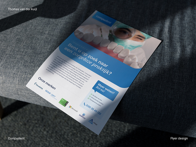
Flyer design green blue Compudent dental tech brand
Compudent Flyer Design – Bridging Dentistry and Technology
As a graphic designer at Thomas van der Kuijl Design, I get to collaborate with various businesses to create designs that help them stand out. One such partnership I’m particularly proud of is my work with Compudent, a comprehensive service provider in the dental market for over 15 years.
My task was to design a flyer that encapsulates the essence of Compudent's services and communicates their unique value propositions in an engaging manner. I opted for a palette that combines shades of light and dark blue, accented with green check marks, as a nod to their strong commitment to service quality.
The front of the flyer features humorous imagery, a deliberate choice to draw in the audience. On the flip side, I opted for professional photography to underline the serious nature of Compudent's work.
To help clearly communicate Compudent's value, I interspersed the design with various elements. These included the logos of Compudent's partner brands and graphic representations of their services. Rounded shapes were used to create a friendly, approachable feel, complementing the overall branding of Compudent.
As a result of this project, I believe that I have created a flyer that not only visually represents the Compudent brand but also highlights the significant benefits they offer to their clients. It has been a fulfilling journey to support Compudent's vision through my work at Thomas van der Kuijl Design.
___________________________________________________________________________
Let's team up and elevate your brand with Dutch Design!
Don't hesitate to get in touch with me via E-mail:
🚀 info@thomasvanderkuijl.com
💼 Let's link up on LinkedIn and take our professional networks to the next level!
📷 Join the Insta-party and catch my latest projects today!

