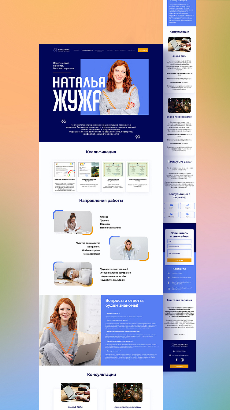
A landing page design concept for Practical Psychologist Natalia
The task: to develop a light design of an information site, not overloaded with data. Make it easy to order a consultation.
Design:
lightweight, with plenty of white space to avoid information overload. The blue color is used, as it has a calming effect on a person, which is very important for such a theme of the site. An easy and simple form for ordering a consultation has been developed.
Ready result: psychologzhuzha.com
More by Tanya Zazulina View profile
Like
