A site for an IT company
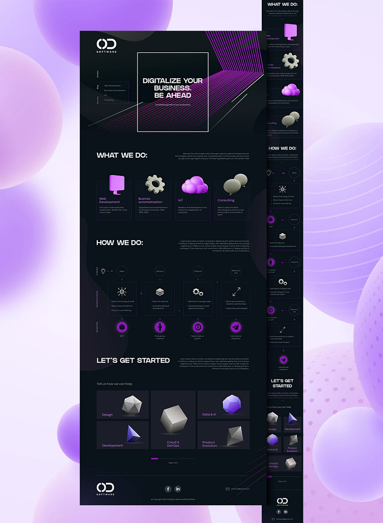
The task was to develop a website for an IT company.
The wishes included a cool design in dark colors, with parallax and animation of information on the pages.
The client was open to bold design solutions, which made the project even more interesting!
⠀
When choosing a color, I focused on the fact that the site should be modern, look high-quality and
inspire respect and confidence in customers. Therefore, the combination of graphite gray with purple became the best solution to this issue.
After all, such a combination gives the site strength, a feeling of high class and reliability.
⠀
For the first screen, thematic images for each section were selected in selected colors. A parallax effect was applied to them, giving the site depth.
The vertical menu on the left - automatically attracts attention and does not get lost among the background image and parallax. And turning it into a hamburger menu when scrolling allows you to always have access to it.
⠀
Glasmorphism (frosted glass effect) was used to make the site more modern.
⠀
Animations were also applied to various blocks (slides, service selection form on the main page, scrolling the text in a circle, etc.), which made the perception of information easier and more interesting.
⠀
Font used: GRIFTER for headings, Object Sans for subheadings and main text.