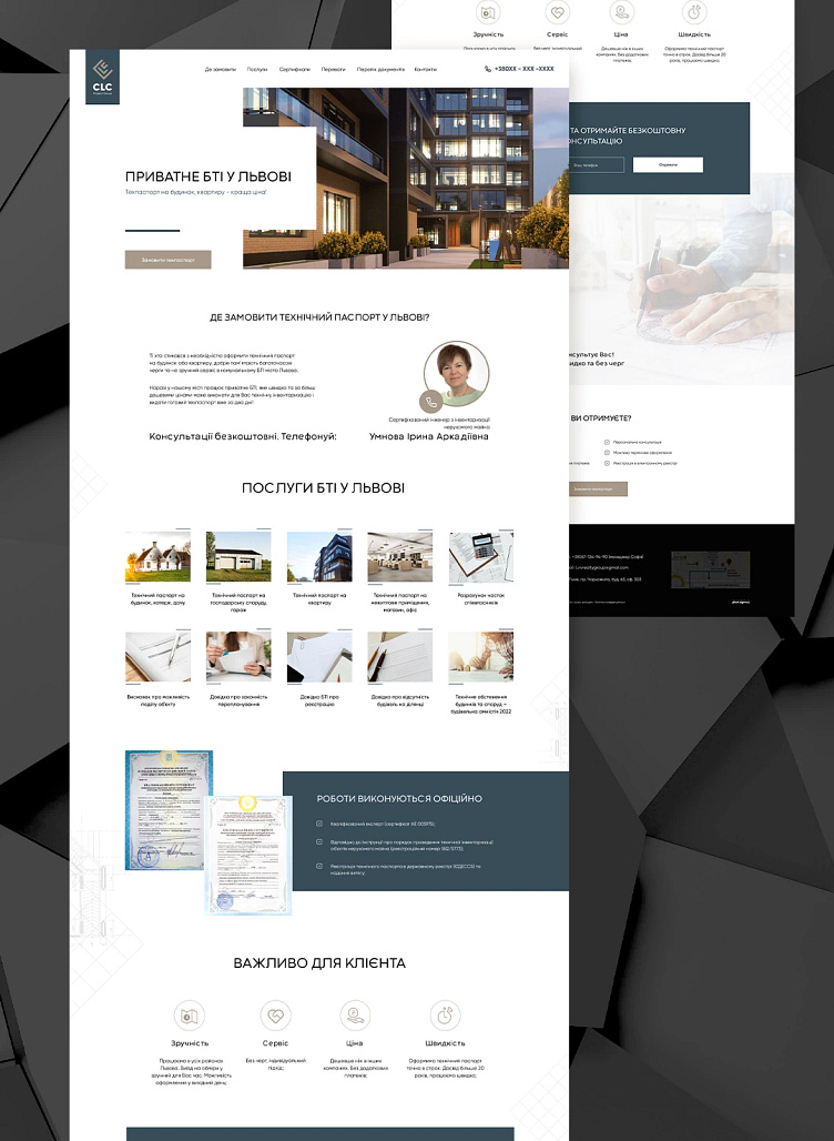
Landing for private BTI in Lviv
🔹Task: fast and at the same time cute. Download speed in the green zone. Mobile layout is a priority.
All additional requirements and text content were written in the brief.
🔹Design:
lightweight, with plenty of white space to avoid information overload. The geometric shapes of the blocks are mainly used for association with the shapes and lines of the buildings.
Drawing schemes were selected as background images, as this is the main element of the services provided by the company.
Stock images selected for each topic are used to dilute the specified text.
🔹Colors used: #a79a8a, #384e59, #030304 (more details at the end of the carousel).
🔹Fonts:
main text - Gilroy;
headers - Codec Warm.
🔹Finished result: https://lviv-bti.com.ua/
More by Tanya Zazulina View profile
Like
