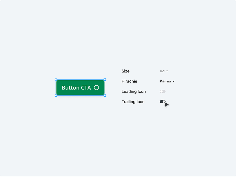
Figma Designsystem for Deichmann 👟💚
Deichmann, the largest shoe retailer in all of Europe, has revolutionized the way people shop for shoes. Not only do they dominate the brick-and-mortar market, but they have also expanded their reach through their own online store.
To ensure seamless user experiences, captivating marketing campaigns, and compelling content, I had the privilege of assisting Deichmann in creating a cutting-edge design system for their web-based online store using Figma.
Following the principles of Atomic Design, we meticulously constructed the design system and crafted an extensive component library. Each individual component is meticulously prepared for its specific use and extensively documented for developers, ensuring a smooth integration into the website.
Through this innovative design system, Deichmann has empowered their UX team, marketing experts, and content creators to harness the full potential of Figma. Whether it's crafting captivating visuals, optimizing user interactions, or designing engaging content, the possibilities are endless.
With every pixel thoughtfully designed and every line of code expertly documented, Deichmann's online presence is poised to leave a lasting impression on customers. The synergy between design and functionality is seamlessly blended, resulting in an exceptional shopping experience for shoe enthusiasts across Europe and beyond.
Deichmann's commitment to innovation and customer satisfaction shines through their investment in this technologically advanced design system. As they continue to lead the European shoe market, their online store remains at the forefront of cutting-edge design, providing a seamless and captivating experience for every visitor.


