Student Accommodation Platform
The challenge
A new website
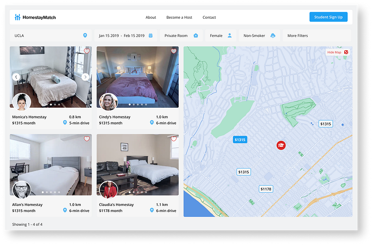
HomestayMatch.com is a website where hosts offer extra rooms to people studying in the United States for a limited period of time. It is conceptually similar to Airbnb, but focuses more on the relationship between the students and the hosts, who will share their lifestyle, culture and language for a truly immersive experience. The client (who has been in the hospitality industry for over 20 years) approached me when a preliminary design had been already prepared by another consultant. The client was not happy with the results due to suboptimal aesthetics and usability.
The approach
A new team
Phase 1: Discuss, wireframe, refine, repeat
The initial phase consisted of an iterative process involving the client: analyze requirements, study user flows, create wireframes, discuss, refine, and repeat. The scope of work included not only the website, but also dashboards, forms, emails, etc.
Phase 2: Assemble and manage the team
The client only had an internal team of back-end developers. They asked me to contract front-end developers for the project. To manage the team I created a kanban board on Asana, and gave access to all the team members and client. I coordinated the entire front-end design and development: assigning tasks and ensuring that the design was properly implemented by the developers.
Phase 3: Test
With the help of the client, I ran several usability tests. The focus was on the host dashboard: I decided to adjust the user flow and introduce new elements to make the interaction simpler. Several iterations of the host dashboard were tested until the difficulties were reduced to a minimum.


