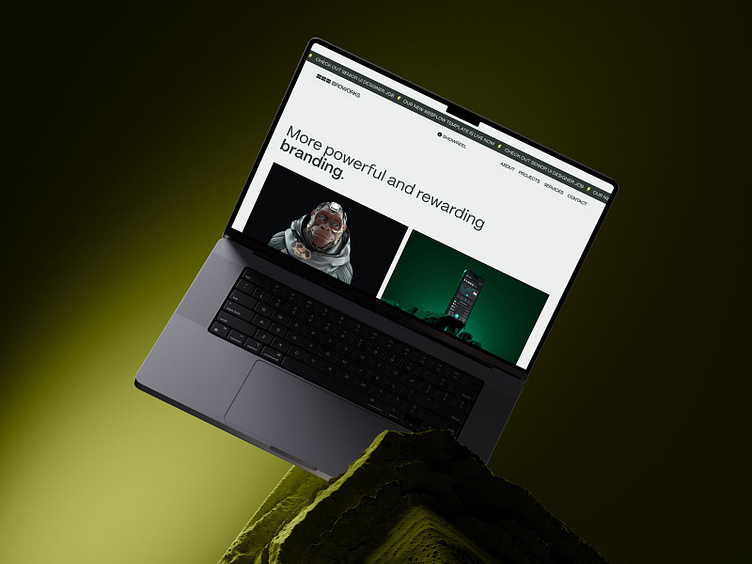
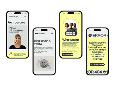
Broworks Homepage Design
We have made strategic changes in Broworks!
Our long journey of website and logo redesign is already yielding great results. Because, once more, we proved that our three-step design process is golden! Going from the UX sprint, through the UI design, to the development phase.
We did this rebranding for us, our studio, but we never forgot that design should always serve the users. When clients visit our website, we want them to immediately see our ways of helping their business.
We designed our website that way so that people can see that our work amplifies and reinforces the message they have to put online.If you haven’t seen our website redesign yet, check it out live here.
Tell us what you think, and stay tuned for more!
Follow Broworks work & life:

