Game Landing Page
💌 Have a gaming website idea? Let's bring it to life together!
hello@ronasit.com | Telegram | WhatsApp | Website
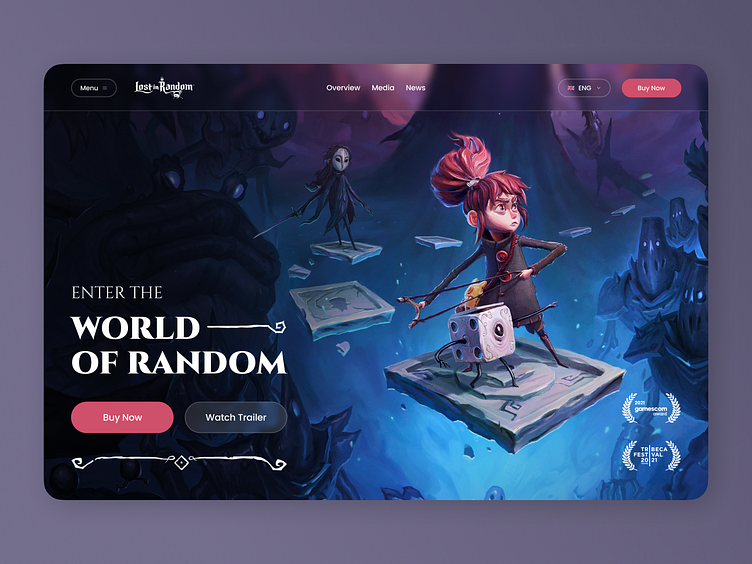
The redesign of the Lost in Random game website was an exciting challenge for our design team, who are avid fans of gaming themselves. Let’s explore the concept in detail!
The home screen of the redesigned website features a navigation panel, an illustration that captures the essence of the game, and a 'Buy Now' button to facilitate an easy purchase. The second page of the website is dedicated to showcasing the game's captivating characters.
The unique feature of this redesign lies in the perfect balance between form and function. The design not only captures the essence of Lost in Random but also provides an intuitive and enjoyable user experience.
In terms of the color palette, the design team opted for a dark theme, incorporating pink and blue accents. These colors are frequently featured within the game, creating a cohesive visual identity and enhancing the immersive atmosphere.


