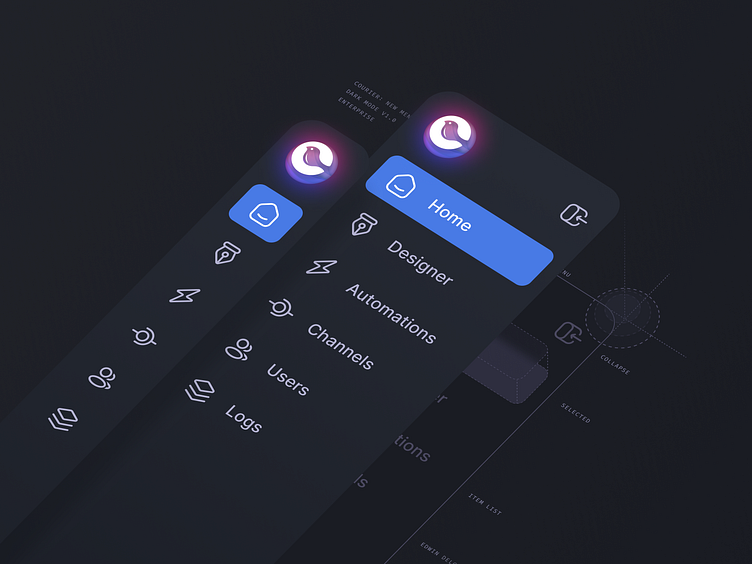
Courier Menu Dark Mode
Complete UI overhaul
Concept
My team and I have been working hard on completely overhauling Courier's UI. This is done by introducing a new design system, tokens, brand, style, light and dark modes, UX, the list goes on 😂. First we will re-skin the app with our new components, then re-structure them to improve upon the experience, and finally re-build section by section to make it faster, lightweight, and generally more delightful.
Here is an enterprise version of our main menu in light and dark mode.
More by Edwin "Kay" Delgado View profile
Like

