Alternate Album Cover #2
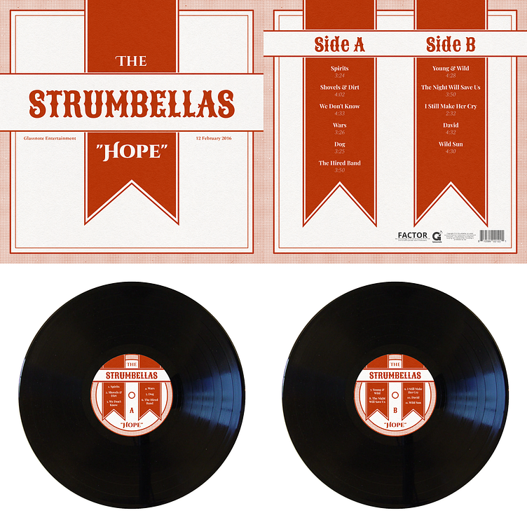
My assignment for my Typography I class (AD 222) was to take an album we were listening to and reimagine it as a vinyl record with accompanying packaging and labels. I chose "Hope" by the Strumbellas.
The Cover of the Album
The original art for this album was very circus-themed, so I wanted to capture a similar feeling with my cover; however, since this was for a typography class, I chose to emphasize the text. Here, that meant going with an old-timey aesthetic. This look was based on a series of photos I took at a muesum of various packages from the late 19th and early 20th centuries. Mass-produced packaging at that time had a rougher texture to it and often stuck to a monochrome color scheme because of limitations in the printing process.
Here is an example of real packaging from the museum that I used as inspiration. You can see clear parallels with the box on the left with its dotted outer border, the double inner border, and the ribbon that wraps around the box and goes over both. I added a ribbon down the middle to add color and to prevent the box from looking too plain and matched its border with the thicker outer border to tie it all together.
The Back of the Album
The back of the album mirrors the design of the front of the album with the same borders around the perimeter. Unfortunately, due to the different types content on the front and back, I was not able to match the ribbons up so that they wrapped perfectly around the package; however I think that in the context of a flat package such as this one it wouldn't be too noticable and it was worth it to make the layout match the content properly.
The Labels
The labels on both sides are the same except for the songs listed and the letter and closely resemble the back of the packaging. I made some alterations to the borders due to the smaller size and added an inner border around the hole in the center.


