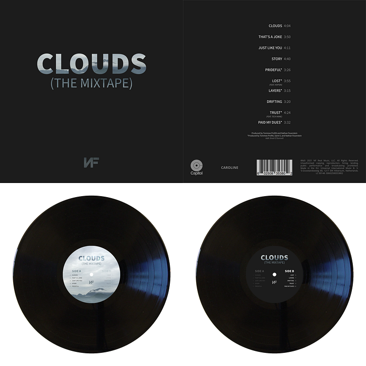
Alternate Album Cover #1
My assignment for my Typography I class (AD 222) was to take an album we were listening to and reimagine it as a vinyl record with accompanying packaging and labels. I chose NF's 2021 album "Clouds" for my first version.
The Cover of the Album
Since this was a typography class, I wanted to emphasise the lettering. I chose to make the cover largely a single color with only the words standing out. Because of the album's name, it was a natural fit to use a picture of clouds in the cover; however using a picture of only clouds looked like it was lacking in depth and seemed off, so I used a picture I took of a cloud-covered mountainside instead.
The mountain picture worked very well, however the dark of the mountain was close to the color of the background, so I had to carefully arrange the image in the lettering so that the parts of the image on the edges of letters were light enough to give the contrast needed to be legible on a dark background. I really like how it turned out, and especially like the way that the incline of the mountain wraps around the bowl of the "O" without touching it, almost emphasizing it in a way.
The Back of the Album
The back of the album is incredibly plain and, while it matches the aesthetic of the cover, it is, in my opinion, a bit bland. While the text on the cover was able to use the image of the mountain to add some texture and depth, the fonts on the back were too narrow and too small to do anything similar. Instead, they are plain colors with white for emphasis and gray for supporting information. I copied the commercial labels found on the real album onto it to make it look more real.
The Label (Side A)
To make distinguishing between the sides easier at a glance, both sides of the record have very different labels. My goal was to, in some ways, parallel the album cover and back. For the label on side A, this meant encompassing the mountain range picture again. Because of the size of the label, and because I wanted the front and back to look more different than the front and back of the album packaging, I decided to invert the layout and put the text into the image rather than put the image into the text.
Both sides of the record show all of the songs and which side they are on; however I used differences in opacity to show which side was which by lowering the opacity of the other side's songs.
The Label (Side B)
Side B of the record mirrors the packaging more directly with a very simple look. It takes the text from the album cover and places it on the same color background while using the same song list aesthetic from the back of the package. As with side A, I lowered the opacity of the off-side song list to show which side is which.


