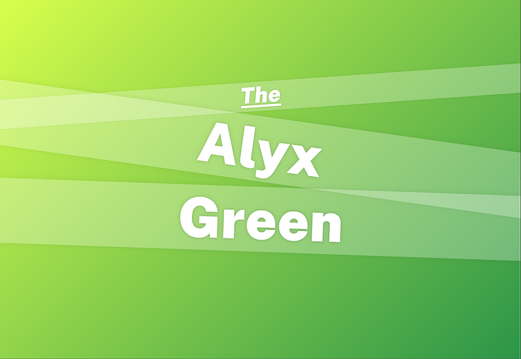
Personal Website Update
I redesigned my website to make it more sleek and modern, using my last name as a starting point by making it the primary color with a soft gradient in the background and a frosted glass effect in the foreground.
I continued the frosted glass aesthetic on the content cards, using a slightly more opaque background to differentiate between the primary header of the card and the body as well as to make the darker fonts more legible. I also added two subtle drop shadows to the primary header text to make it more legible.
I used a series of media queries I manually configured to make sure that the text always stayed (mostly) centered vertically and never went off the screen on normal-sized displays regardless of aspect ratio.
The content cards scale well to mobile displays and stack vertically in narrow aspect ratios. The scrollbar was a bit of a challenge since I wanted to keep it for accessability and ease-of-use, but it looked horrible (especially on mobile). I themed it to be subtle enough that it doesn't stand out while still being usable.
I created a favicon for the site that uses the same gradient as the background and the same font. Because of its small size, I used only my first name and did away with the frosted glass.
I also created a matching preview graphic for embedded links. Because of the aspect ratio and size, I again ditched the frosted glass and tilted text and instead focused purely on making it legibile at any size.


