Qerra - Logo Design
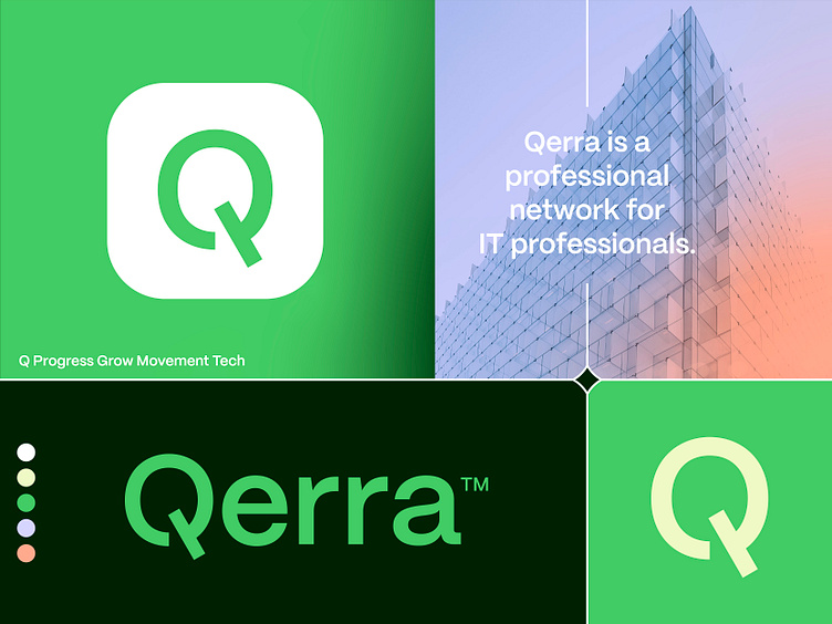
Professional network for IT professionals.
Logo Design for Qerra.
Qerra is a professional network for IT professionals.
Concept:
Letter Q, Progress, Growth, Movement, Tech and IT.
I wanted to start this project with the focus on a clean and bold looking word mark. Along with this typeface selection, I decided to modify the letters to make it perfectly suit the goals I had in mind regarding the letter Q adjustment mainly.
Loving the fact it's still readable enough and yet holds so much more meaning and function.
Happy to hear your thoughts and possible points of feedback.
Hit L to support!
___________________________________________________________________________________
___________________________________________________________________________________
Let's work together and elevate your brand! 🚀
Feel free to reach out via Dribbble DM or E-mail:
👉 info@jeroenvaneerden.nl
💼 Connect with me on LinkedIn / Read my Client Recommendations
🎬 Check my YouTube for Logo Tutorials / Learn Logo Design
🔗 Follow me on Instagram / See BTS and New Content
🛒 Buy my pre-made or unused logos from the portfolio
💬 Tweet with me