How iOS widgets fit into AR technology
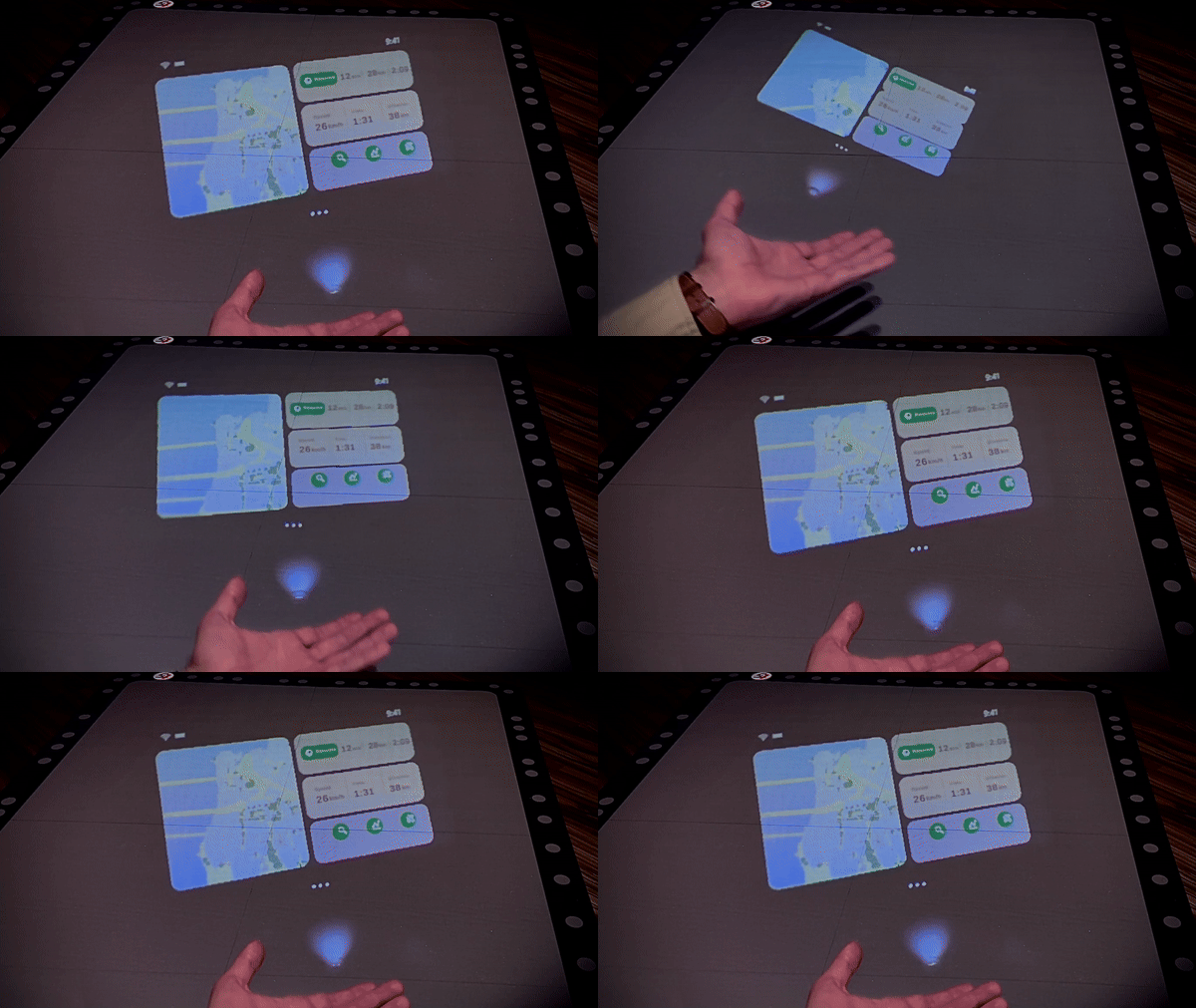
AR mockup for a navigation app.
Mockup in Microsoft Maquette, for VR. Design in Unity, for Tilt5 AR
Why widgets are crucial for AR?
Cognitive overload is a serious problem. Designers have to pick carefully what to show and when to show it. When you think about it, people expect us to do so anyway. They expect technology to be more integrated with their lives.
Popularity of wearables and voice assistants point to that.
What does that mean for AR apps? Well, widgets look like the best root to take.
The challenge facing AR designers is how to show the most essential functionality, at the right time, and move out of the way.
Apple Watch introduced Glances to tackle this exact issue. So it’s safe to assume the initial AR apps for visionOS will have to rely closely on iOS widgets.
After all, widgets are perfect for when you are on the move. Designed to perform one specific task, at minimal time.
CarPlay took the concept even further, showing multiple widgets at once. It translates well into 3D and is great for displaying multiple contextual features.
This gives me even more confidence, that widgets will help our interfaces look less out of place in AR.


