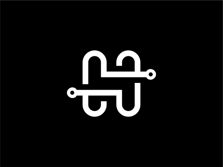
Minimalism H Letter Initial Logo
A "Minimalism H Letter Initial Logo" is a simple and streamlined design that focuses on the letter "H" as its central element. Minimalist logos are characterized by clean lines, simplicity, and a reduction of visual elements to their essential forms. They aim to convey a sense of elegance, sophistication, and modernity.
In this specific logo, the letter "H" is used to represent a company or brand with a name that starts with the letter. The design approach is to distill the letter into its most basic and recognizable shape, removing any unnecessary details or embellishments. The resulting "H" symbol is often geometric, sleek, and visually appealing.
The minimalist style emphasizes negative space, allowing the letterform to stand out and be easily recognizable. The logo may consist of a single solid color or a limited color palette, typically in muted or neutral tones to maintain a clean and understated look. The choice of colors can be influenced by the brand's identity, target audience, and industry.
The simplicity of the Minimalism H Letter Initial Logo lends itself to versatility and scalability, making it suitable for various applications. It can be used across different mediums, such as print, digital platforms, merchandise, and signage. The logo's simplicity also ensures that it remains visually impactful and easily recognizable, even at small sizes or when reproduced in black and white.
The Minimalism H Letter Initial Logo is favored by companies or individuals who value a minimalist aesthetic, contemporary design, and a sense of sophistication. It communicates a sense of professionalism and simplicity, reflecting a brand identity that is clean, efficient, and modern.
Overall, the Minimalism H Letter Initial Logo is a visually appealing and minimalist design that focuses on the letter "H" as the primary element. Its clean lines and simplicity convey a sense of elegance and modernity, making it an ideal choice for those seeking a minimalist and sophisticated brand identity.
