Dog Walking App: Furreal.
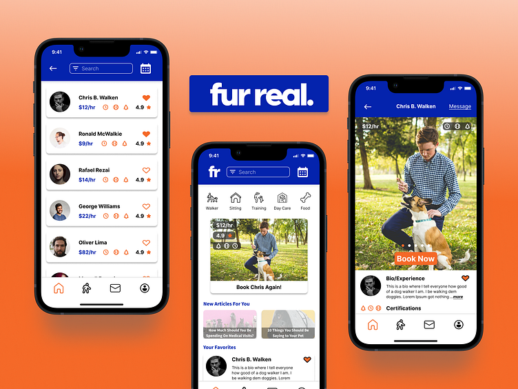
Sometimes life can get too busy and pets don’t get the attention and exercise they need to be healthy. This app is designed to quickly find trustworthy walkers for dog owners. Over two and a half months I had the opportunity to lead the process, from research to wireframes and final visual designs. You can see the designs which include walker tracking, messaging, and a home page that can quickly get walks booked as well as advertise companies in the same industry.
Research
The main priority for our clients is finding trustworthy walkers. Pets are family too, so you shouldn’t hand them off to just anyone. Other problems we discovered are cost and convenience. “How can we make the app engaging but informative at the same time” was a question I asked myself throughout the process. Highlights from the research:
Our typical user is in the millennial demographic who owns at least one pet and works away from home all day. Dogs need exercise and attention to be
their healthiest, but pet owners can't just trust their furry child with anyone.
They need something trust worthy that doesn't break the bank because
pet expenses are already high.
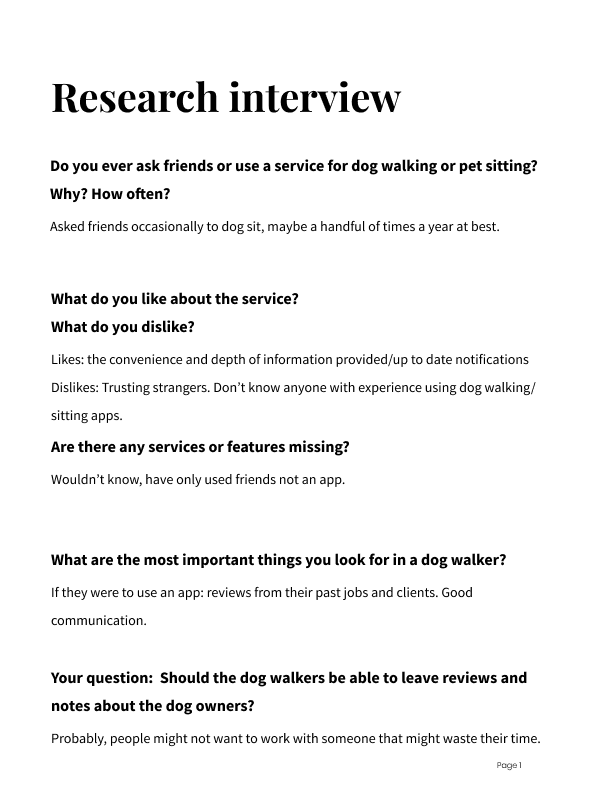
We've conducted multiple interviews with dog owners, and you can find
the notes for one of them below.
The goal is to build an app and brand culture that can be trusted easily.
This could help users by giving their pets a healthier lifestyle. And anyone
with a pet knows how much joy they bring, so any chance to prolong their
time with them is a chance worth taking. A successful solution for the product and business would look like a low cost dog walking service with an opportunity to get ad revenue from top pet brands.
We want to build a home page that provides more than just dog walking. A page that has blog posts geared towards pet owners that might want a little more knowledge. A place to advertise healthy dog foods and other things that
promote a healthy lifestyle for pets. All while being simple to navigate and
find your favorite dog walker.
Market Research:
The major competitors in the industry rely heavily on visuals to engage the user and keep all the details on further pages. Getting users to engage right away and then building their trust in the walker more and more as they click through.
User Research:
We interviewed a handful of dog owners. The process led to finding that trust, convenience and affordability are some of the biggest factors in booking a dog walker. Communication and safety (such as background checks and tracking features) were also things that would be a priority to be built into the application. Walker schedule flexibility played into the final booking page design as well.
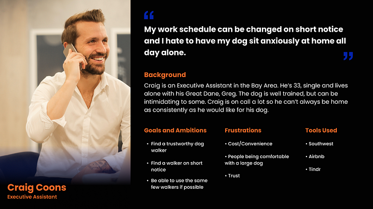
Persona
Using the findings from the user research, a persona within a target demographic was created. This helped solve decisions on how our biggest problems would be solved. The personas age, experiences and priorities that represent a demographic influenced the overall visuals.
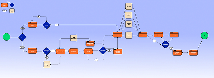
User Flow
The initial mapping made for the app that highlights how to go from sign up all the way to booking a dog walker.
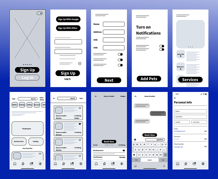
Wireframes
The wireframes started out much more detail/info focused to build trust and were much less straight forward. Once the visuals were being built, a more simplified design was built around this original foundation.
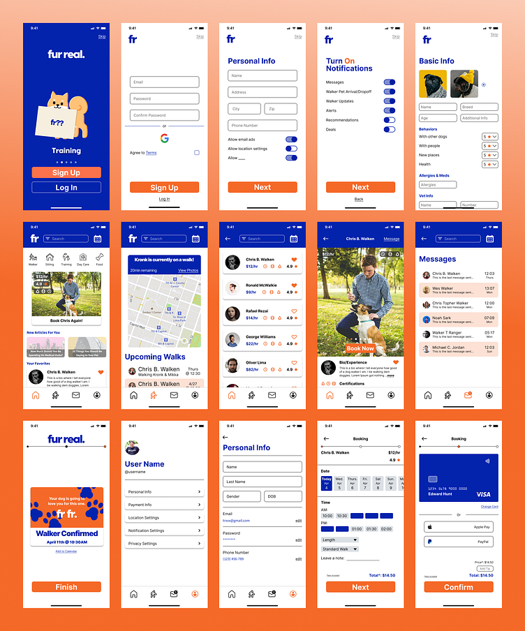
Visuals
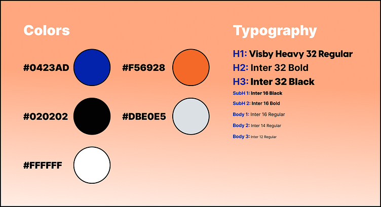
Bold but minimal colors. A simple black white and gray to not distract from the main two colors and all the photos and visuals. The Visby font is used in the logo and headings while the inter font is a familiar body.
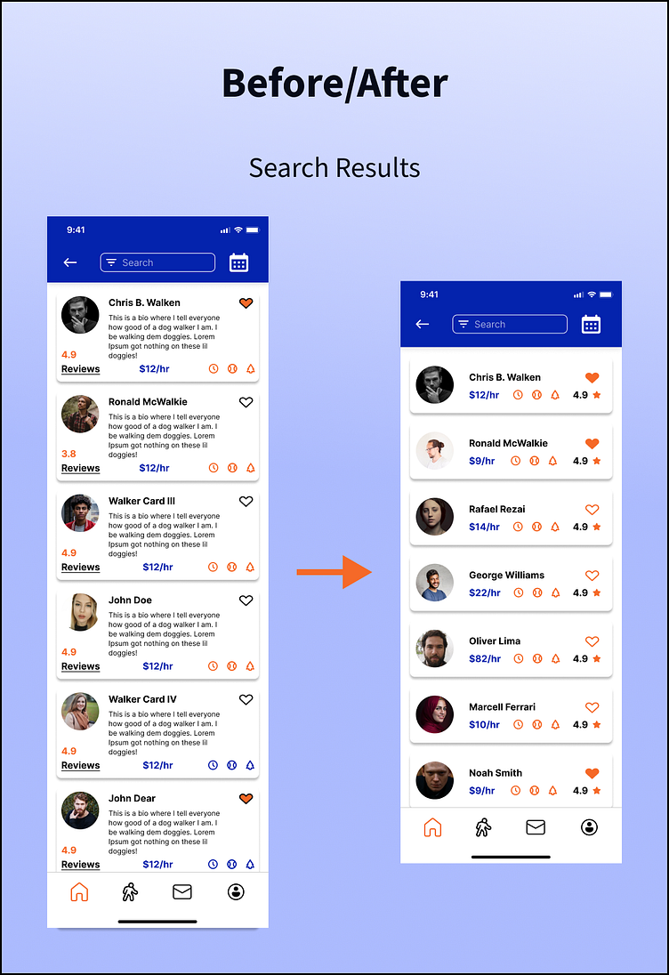
The goal was to get our users to trust the walkers as soon as possible, but it initially led to a much more cluttered design. The designs ended with a much more visual and minimal focus to peak the users interest and speed up the process of using the app. Using larger photo scrolls on the onboarding and walker pages, the users can learn and trust quickly as users will trust what they see more than what they read online. The home page icons, “book again” card, and “favorites” will get existing users to what they want as fast as possible without having to waste time in their busy days searching.
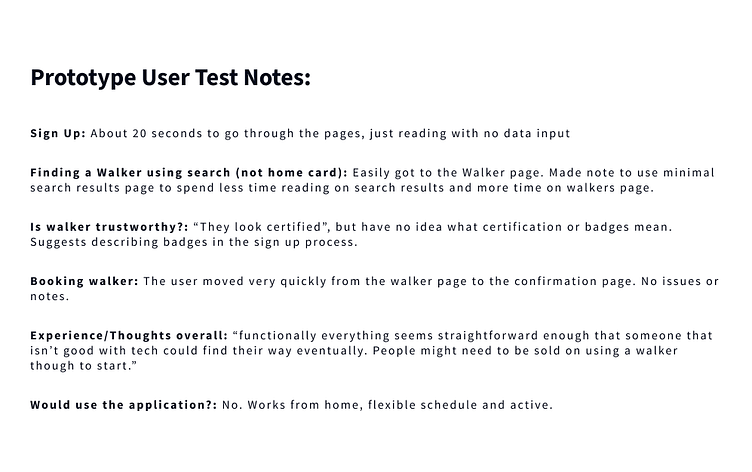
Prototype Testing
We tested our prototype on a few users asking them to complete certain tasks. The notes for one of the tests can be seen here. These test led to a few notable changes in the final design as well.
Closing and Takeaways
First of all, wow thank you for scrolling this far into this project! That had to of taken some time and it is very much appreciated (even if it you scrolled straight past everything)!
The main takeaway from the design process on this case study was the use of space and accessibility. Making the app useable for people of all ages. The challenge of merging minimal designs with building client trust. I find the outcome to be a design that is very easy to get to the goal, which is in this case is to book a dog walker. The design is simple enough that a person with lesser tech skills could easily get to their dog walker and be guided through the booking process.
Thanks,
Travis Allen
