Streaming Site: Case Study
Most streaming services nowadays offer a "kid profile" of some kind. However not every kid knows how to get to that profile after their parents have been watching something. The goal of this case study was to find the fastest and clearest way to switch user profiles for children. We want to give quick & clear confirmation as well as UI changes so parents and children can quickly tell if they are on a safe profile without having to navigate the app at all.
My role on this project was to lead all design work from user flow to wireframes and final designs based on the provided research. This is a fictional streaming company.
Research
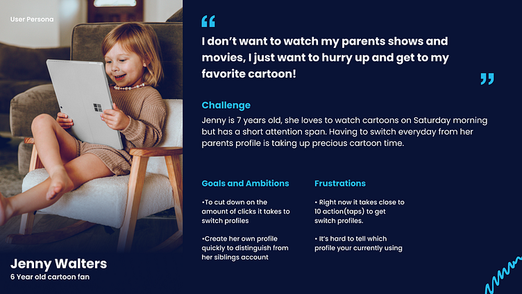
All research points towards younger children having difficulties transitioning to their own profile. Users as young as 4 have their own profile to view family friendly content, but sometimes it can take 10 or more clicks on the remote to get there. This is main problem we attempted to solve in our designs. If a user interface isn't child friendly, it becomes more likely that the parent will unsubscribe. Based on market research and how competitors are handling profile switching we made it a goal to be able to switch profiles in under 6 actions from anywhere within the app. We want to make sure there's a visual confirmation that profiles have been switched, UI differences between an adult and kid profile. Based on all this research, a User Persona was created.
Market Research
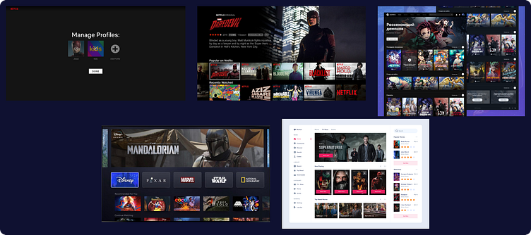
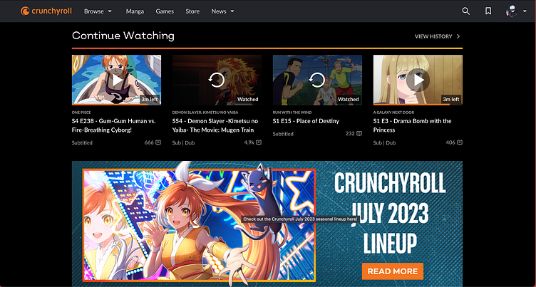
The biggest thing we noted from major competitors is the lack of visible navigation and none of them have a single click profile switching option. We want to eliminate this to make this site 4 year old friendly but avoid the cluttered feel of other competitors shown below. Our goal was to balance the emphasis on the focus of movie/tv visuals like Netflix and Disney+, while also providing enough detail for children to quickly navigate and not get lost. A site we think does this visually well is Crunchyroll, however they lack profile swapping at all.
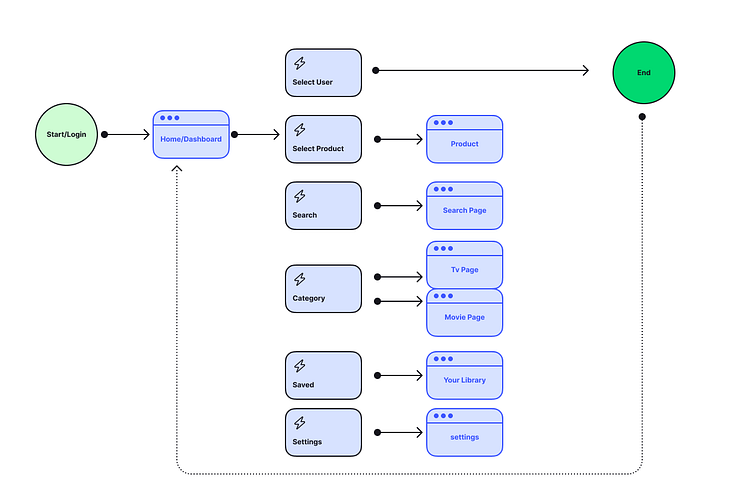
User Flow
Here is our quick User Flow used to map out how quickly the profile swapping can happen from anywhere within the application. Swapping is possible in 1 or 2 taps/actions from anywhere by putting profile access visuals on the home screen. Ideally to have a design more like Netflix, all the navigation and profile would be in an overlay perhaps, but for this case study we chose an option with the fewest actions needed.
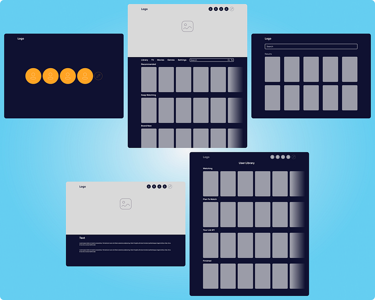
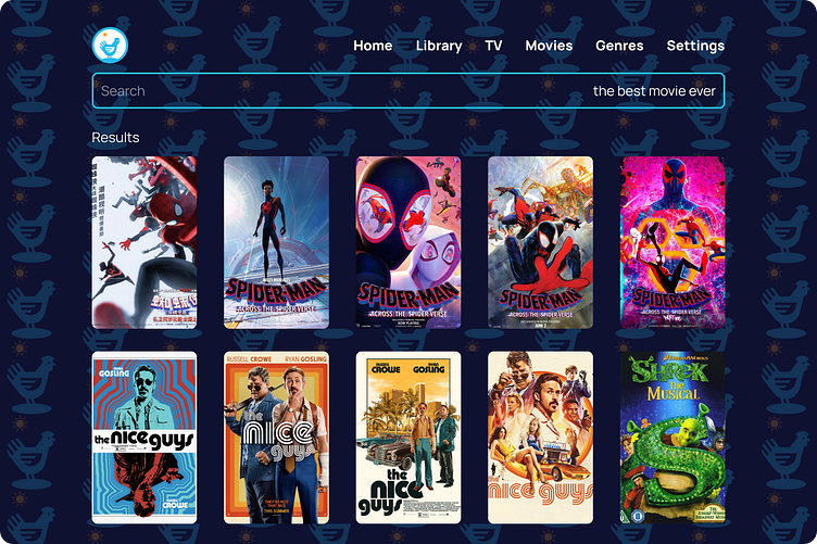
Wireframes
A few examples of the wireframes created. The Home screen contains a large feature card, a simple sticky nav bar, a profile section at the top with a highlighted selection and movie poster size product cards. A simple search result screen and a product screen with a full sized product card followed by full details.
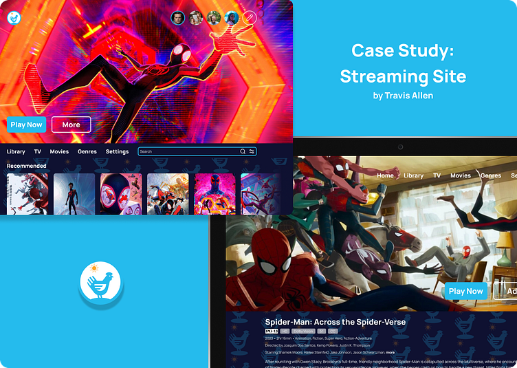
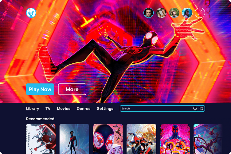
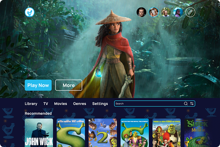
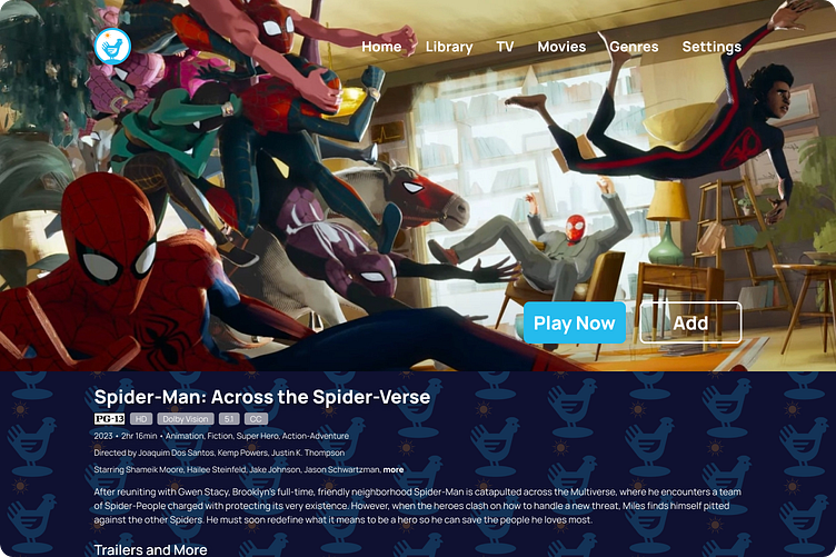
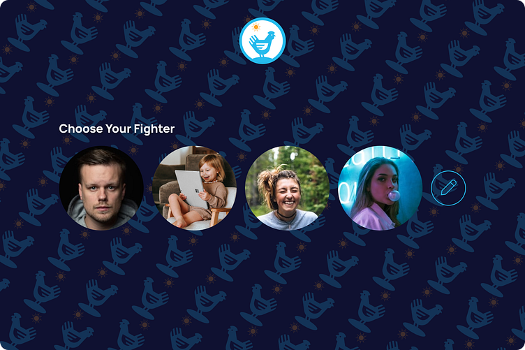
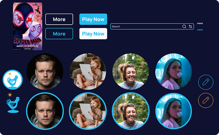
Visual Designs
The key features include the photo user profiles at the top of the home screen, highlighting the active profile. A quick confirmation screen (see in prototype/video) and a background pattern on every page when a kids profile is active. A clean solid color for normal profiles. No navigation needed for parents to check on their kids. Profile switching is accessible in 2 clicks from anywhere by pressing home.
UI Components
Prototype
You can check out the prototype for yourself in figma here!
Take Aways
The biggest takeaways for me as a designer were having to think about a different demographic than normal and how much that would change the outcome of the designs. Todays world is constantly going with less is more, just like Disney+'s interface which only has visuals/pictures on it. A practical and accessible design can be just as successful in the same market as a minimal, sleek or a whatever is "in" design.
