Pet Walking App Case Study
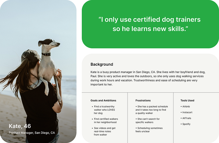
The user of this app is a dog owner. They're facing a real challenge trying to find a hassle-free way to trust someone reliable to walk their dog. They need a straightforward method to book walks with nearby caregivers. The issue at hand is that their dog isn't getting enough exercise, and the user simply doesn't have the time during the day to take them for walks.
The primary objective of this project is to become the number one platform for dog owners, connecting them with safe, dependable, and affordable dog walkers. The goal for Dane is to be the go-to spot for all dog owners out there.
In terms of my role, I was involved in every step of the product design process, from conducting research and defining the project to brainstorming ideas, creating prototypes, conducting tests, refining the concept, and measuring its success.
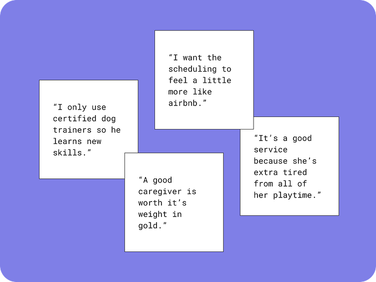
I conducted five interviews via zoom to understand the user’s pain points. Users were male and female, ages 28 - 70. I found three main takeaways from the interviews, such as knowing if a walker was trained/certified, trustworthiness, and easy and clear scheduling. Cost was not a concern with these users.
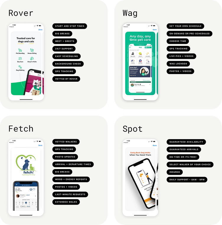
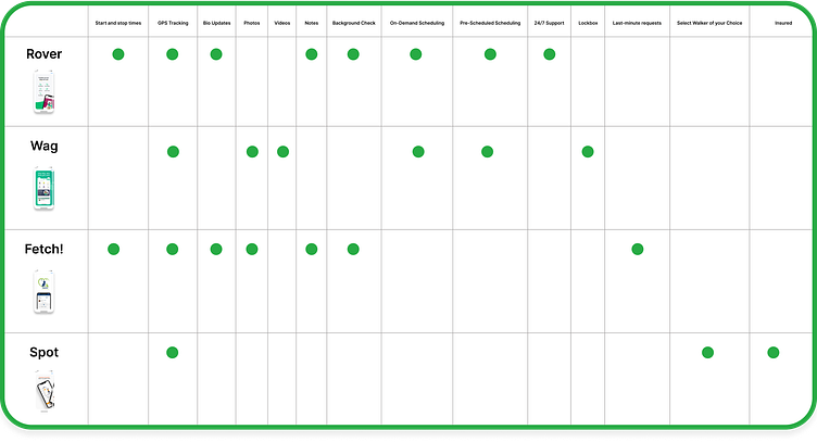
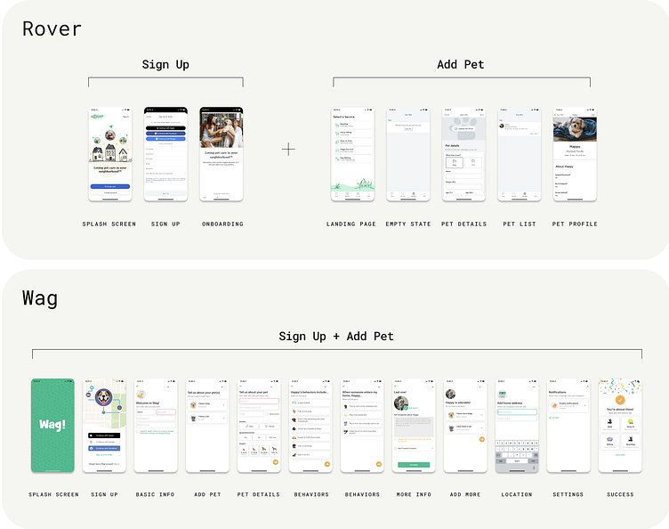
Features were compared across Rover, Wag, Fetch, and Spot. After listing features found on their app, I created a visual chart to easily compare where the overlaps were.
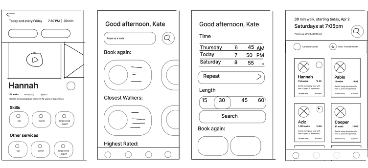
Based on the feedback gathered from user interviews, it became evident that two key factors stood out as the most significant: the use of certified walkers and trustworthiness. Consequently, we structured the walker cards in a way that prioritizes these essential features at the top, making it convenient for users to access this information readily. On the other hand, distance and cost, while still relevant, were considered less critical and placed lower in the hierarchy.
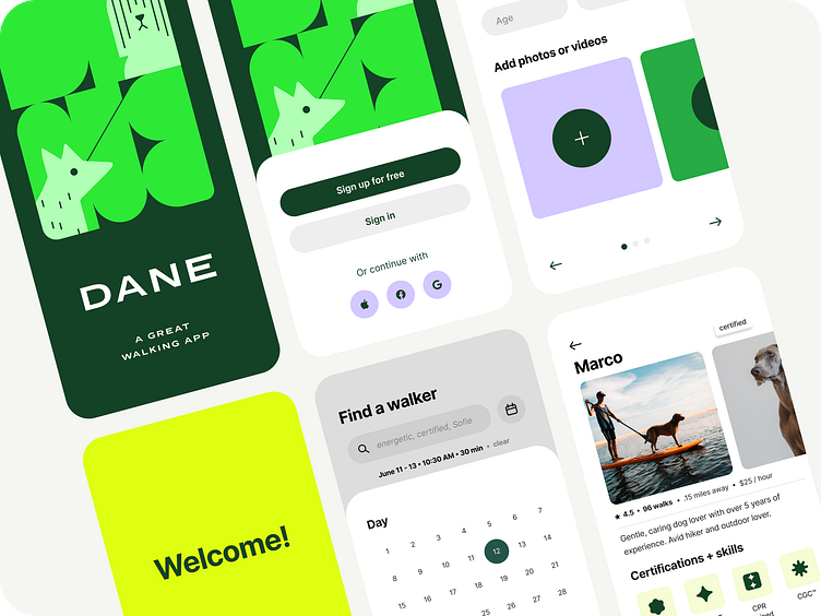
In the final design, we made a significant change from a double-column layout to a single-column format. This alteration was aimed at enhancing user experience by making essential information more accessible and easier to read, thus streamlining the overall process.
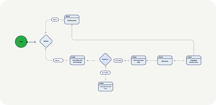
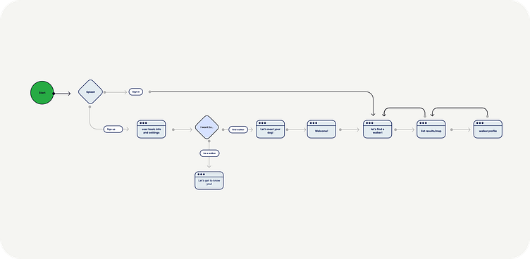
After comparing Wag and Rover, I noticed Wag's sign up flow was lengthy before getting to search for walkers. Since this user is very busy, I shortened the onboarding in the second flow, to improve the chance of completing sign-up. They can quickly get to the “Find a Walker” section to learn about credentials, which is their top priority.
Initial ideas were sketched out quickly in Figjam

Initially, for the “Reserve Walker” screen, I had placed the CTA/Messaging buttons at the top. I later moved these to the bottom in order to create a consistent header experience with other screens.
After many attempts to place scheduling info on this screen, I revised the experience to use a pop-up modal to confirm or edit the scheduling info, to not overwhelm the user on this screen.

During the early stages of the design process, we experimented with various visual concepts, including larger color palettes and even a dark version. However, after careful consideration, we settled on a final option that features a smaller, more refined color palette. The aim was to create an app that feels both enjoyable and easy to use, and the chosen colors were thoughtfully selected to align with this objective.
To ensure optimal readability, we opted for a clean sans serif font with a tall x-height. This choice was made to enhance the overall user experience, making the content easily digestible and accessible.
Additionally, we introduced unexpected illustrations throughout the app to keep the user engaged and add a touch of delight to their journey. These illustrations serve to maintain user interest and provide a unique visual experience.
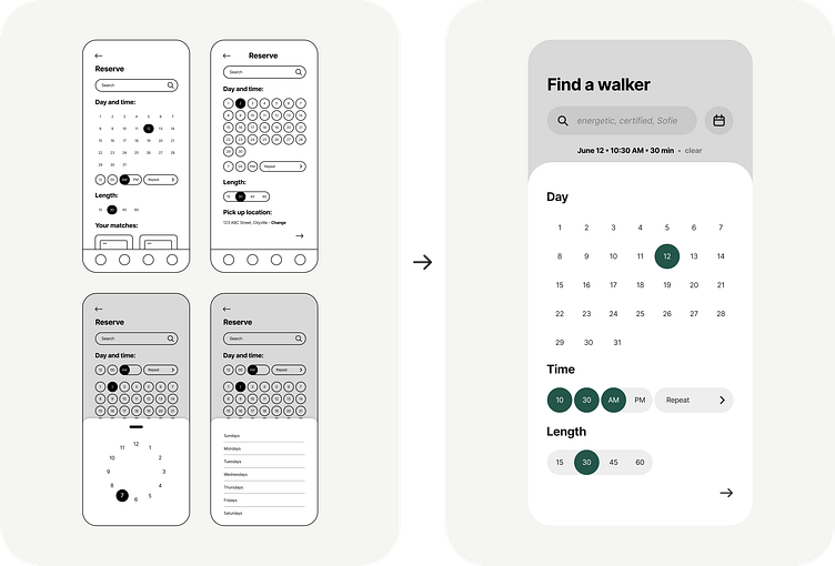
In the first wireframes, day, time, and length of walk info were part of the main search flow. In user testing, I saw that users didn't immediately think to search there. To make it more intuitive, I removed it from the main search bar and added a calendar icon, so users could easily find it.
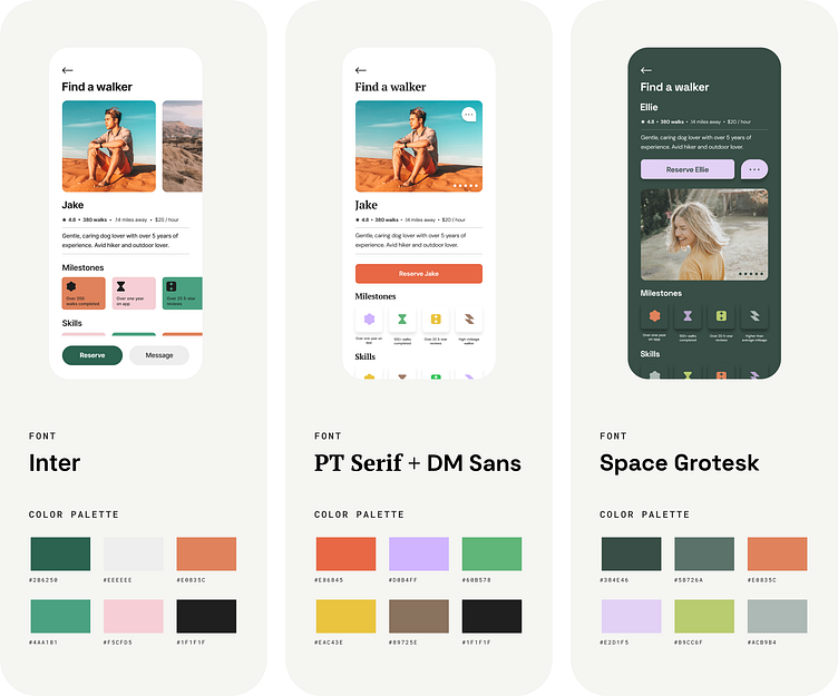
During the early stages of the design process, I experimented with various visual concepts, including larger color palettes and even a dark version. However, after careful consideration, I settled on a final option that features a more refined color palette to create an experience that feels both enjoyable and easy to use.
To ensure optimal readability, I opted for a clean sans serif font with a tall x-height. This choice was made to enhance the overall user experience, making the content easily digestible and accessible. Additionally, I introduced unexpected illustrations throughout to keep the user engaged and add a touch of delight to their journey. These illustrations serve to maintain user interest and provide a unique visual experience.


Throughout this project, I gained valuable insights into the intricacies of designing a user-centric app. By conducting user interviews and testing, I learned the significance of prioritizing essential features like certified walkers and trustworthiness to meet user expectations. The iterative design process allowed me to adapt and refine designs based on user feedback, resulting in a more intuitive and user-friendly experience. Additionally, exploring different visual design options, such as color palettes and font choices, taught me how subtle design elements can significantly impact the overall feel and usability of an application. Overall, this project provided me with hands-on experience in conducting research, making informed design decisions, and creating a product that truly meets the needs of its users.

Try it out!
Click here to interact with the prototype