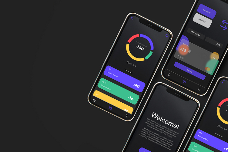
Cryptic-Wallet
A redesign project
The redesign of this banking app's user interface to a clean-cut, minimal, and clear design was a crucial step in enhancing the overall user experience and ensuring the app's success.
With common tools such as figma, photoshop and thorough design research, this redesign was achievable.
What makes this redesign so great?
By reducing visual distractions and providing a clear hierarchy of information, users can effortlessly find what they need, leading to a more intuitive and enjoyable experience.
A clear interface design prioritizes legibility and readability, ensuring that users can easily comprehend and interpret the information displayed on the app. Clear typography, appropriate font sizes, and ample spacing between elements contribute to better readability, reducing user fatigue and improving overall comprehension.
Consistency and Familiarity:
This familiarity increases user confidence, reduces cognitive load, and allows for a more seamless and efficient user journey.
These improvements contribute to an overall superior user experience, resulting in increased user engagement, satisfaction, and the success of your app in the highly competitive banking industry.


