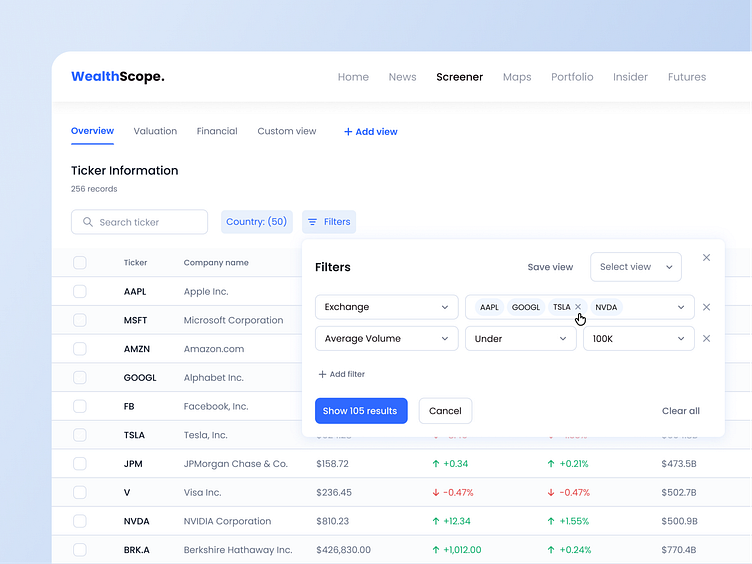
UX/UI for an Investor's Website Screener Page
The primary objective of this portfolio project was to redesign the website, focusing on enhancing user-friendliness and improving the usability of filters. The aim was to create a more modern, clean, and intuitive design that provides a seamless user experience.
Don't forget to press ❤️ if you love it and share feedback!
Thanks!
======================
Connect: helen.zhuravel.design@gmail.com
More by Helen Zhuravel View profile
Like


