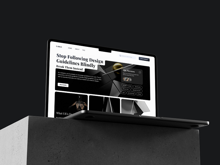
Article and blog landing
with a simple layout that is easy to navigate. The use of white space and minimalistic design elements keeps the focus on the content, allowing users to read and engage with the articles without distractions. The typography is clear and easy to read, with a consistent font style and size throughout the site. The color palette is limited and subdued, with only a few accent colors used sparingly to draw attention to important elements. Overall, the design of the website prioritizes functionality and readability, creating a user-friendly experience for those who visit the site.
More by Fluxio Support View profile
Like


