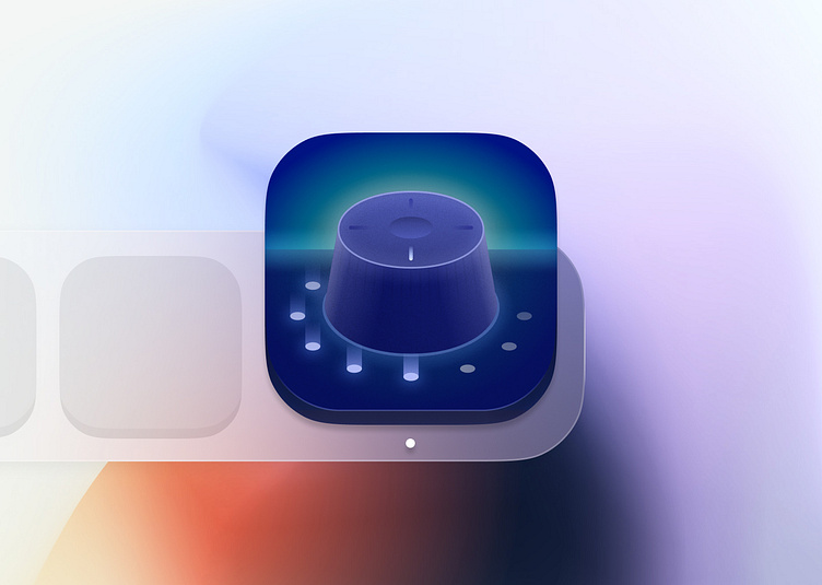
App icon | 100 days design challenge
This concept is for the subject of the "App icon" in the 100-day design challenge.
In the case of designing app icons, you should consider the various sizes and uses of your icon, so it will look and feel familiar (as much as possible).
But I wanted to go overkill with this ...
First, it was a simple shape I accidentally came across during work. But then I transformed it into a control knob/dial.
It took me more than I expected, especially the top of the knob; It felt like something was missing and I could not put my finger on it. But in the end, everything came together smoothly.
What would you call this app?
More by Mostafa Jandaqi View profile
Like

