IPTS/Shuddle & Zenith Design System
Overview
The Zenith Design system for fictional space travel company IPTS was created as part of a capstone project for the Scaling Design Systems course hosted by Dribbble. I served as design lead on this project, completing it solely by myself.
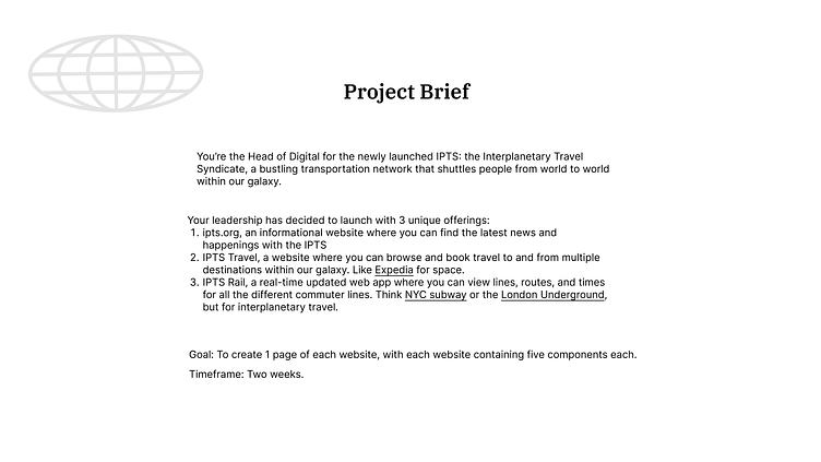
With the project brief and assets provided below, the goal was to create one page from each of IPTS' three offerings. Critical to this project is the implementation of a design system that allows for flexibility and empowers creativity. Each website must contain a minimum of five components each. The time frame given was two weeks - this will become crucial regarding the final outcome.
Research
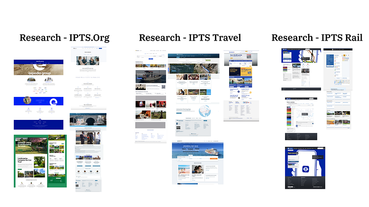
In the search to create familiar and standard components, as well as how to utilize creativity within my system, I engaged in competitive research. Researching well-known offerings within the travel industry allowed me to understand what patterns were often present in sites like Expedia, Amtrak, and Southwest. Pulling inspiration from non-travel related sites lead to a breakthrough in my final product for the IPTS .org site and was invaluable.
Wireframes, Content, Structure
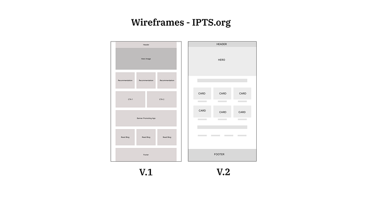
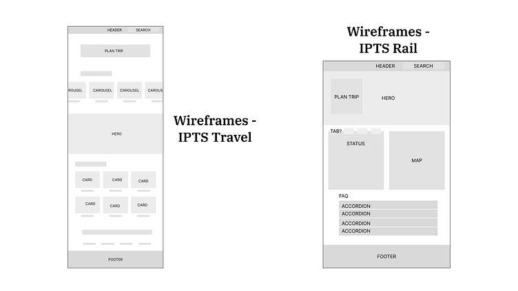
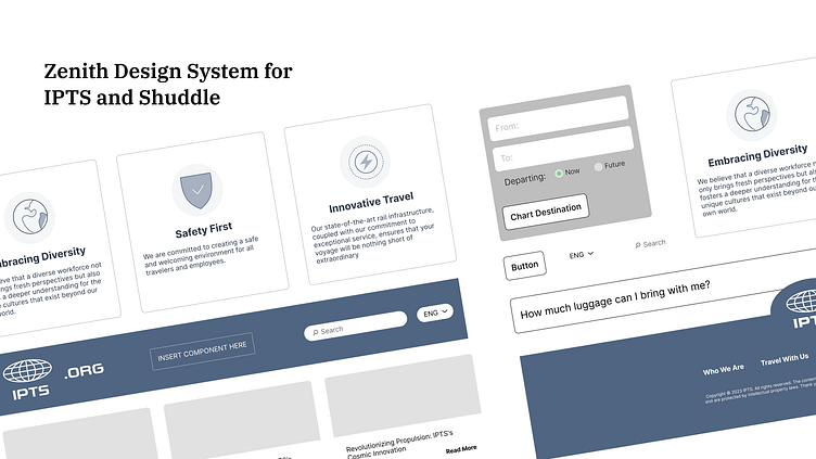
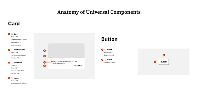
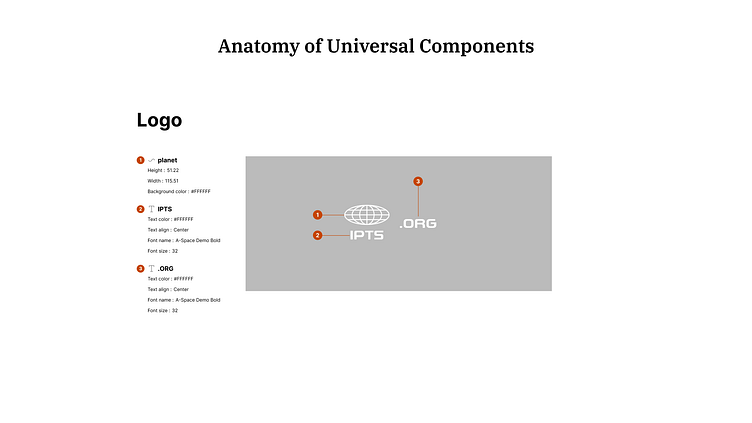
Key Components
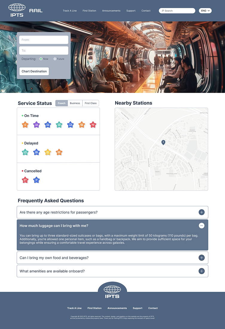
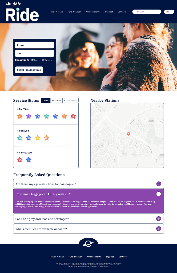
After research, it was clear that these five components were the most essential to create for the three products. Though IPTS Rail did not end up making use of the card component, said component was still deemed crucial enough to the layout and design of the 2 other products.
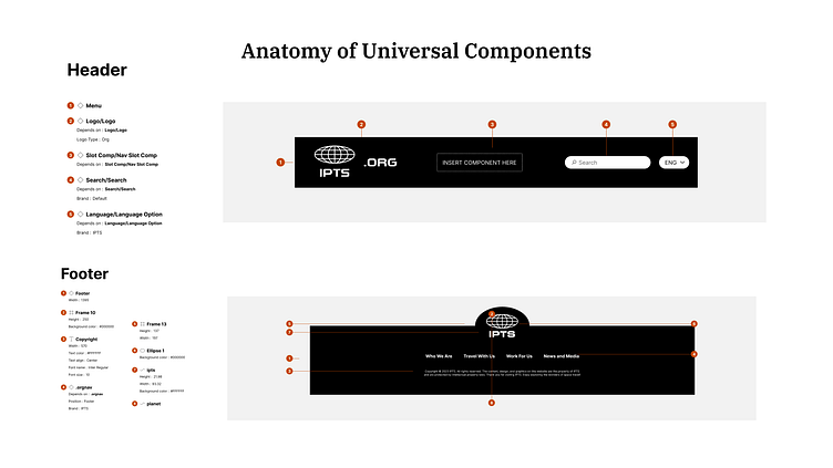
Turning Components Into Results - IPTS Sites
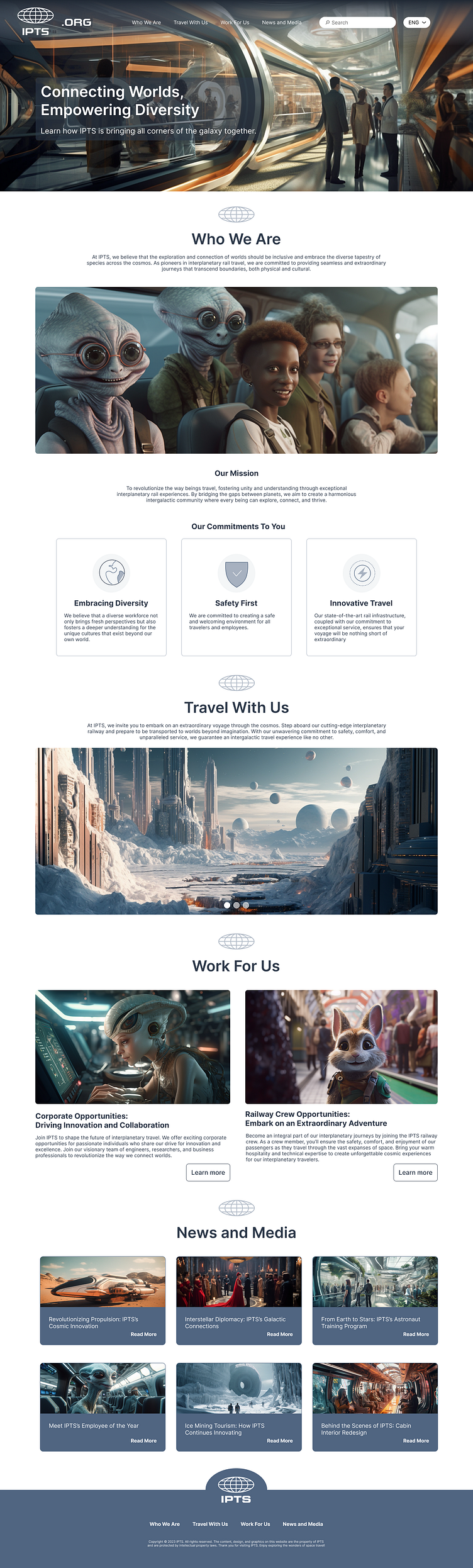
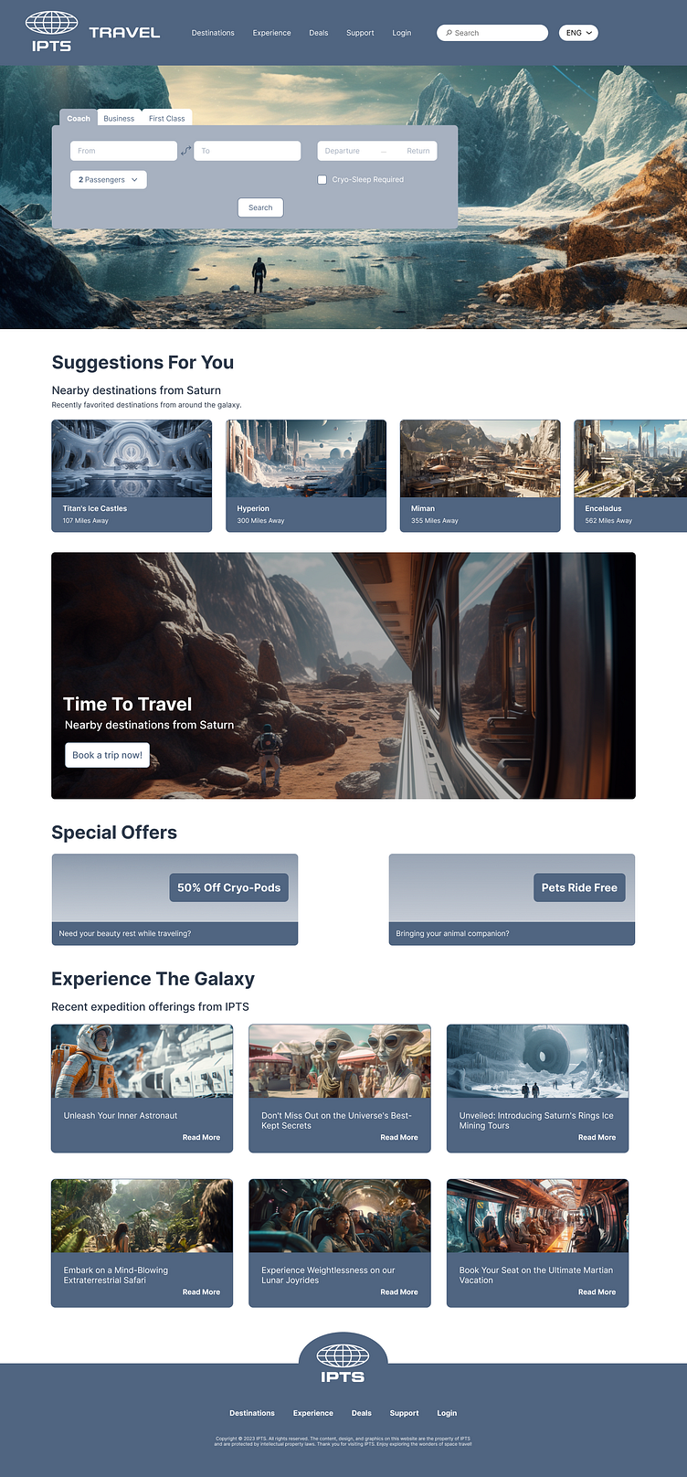
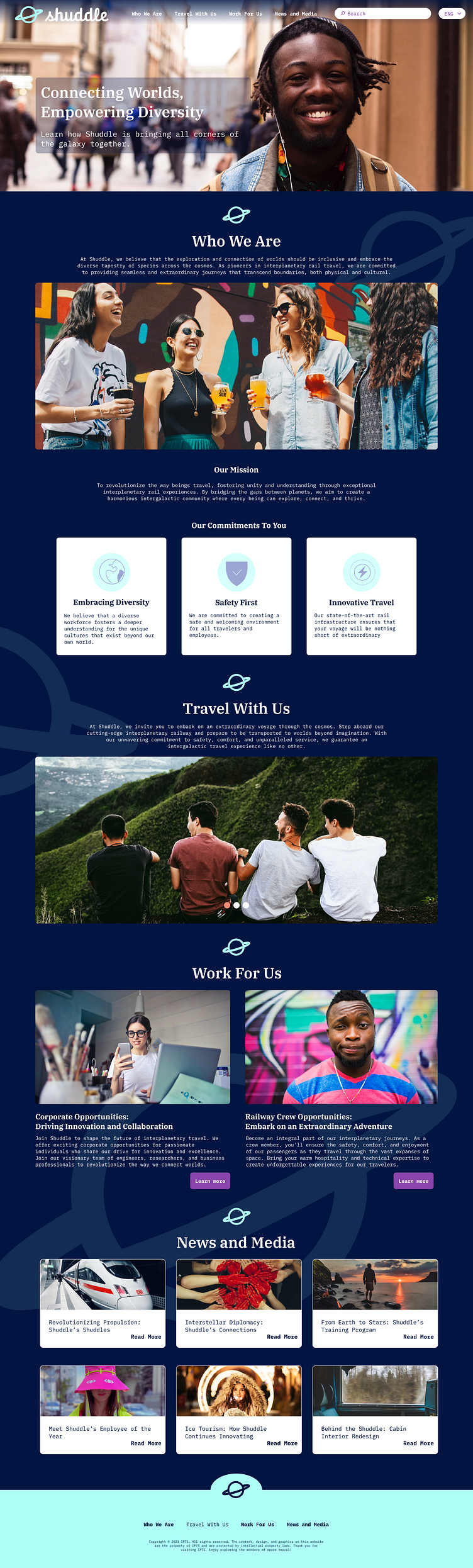
Pulling image assets from Midjourney allowed me to bring a sleek, futuristic, and sophisticated vibe to the IPTS brand. Turning the header into a component allowed me to get creative with the IPTS.org site, creating a transparent nav that fit seamlessly over the hero, yet could still be used with a solid block of color as the background for the 2 other IPTS products.
The Twist - Shuddle Rebranding
One week into this project, we were thrown a curve ball - IPTS would now be rebranded as Shuddle. All of the products would be rebranded with different fonts, color styles, and voice. This ultimately would change the three products from upscale and futuristic to youthful and playful.
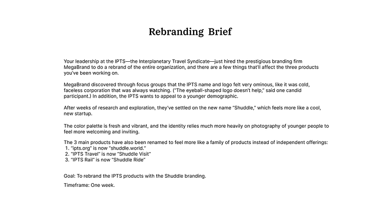
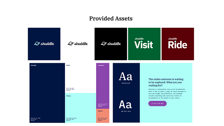
The Shuddle Rebrand
With components, font, and color styles already established, it was an incredibly quick process to transform the IPTS sites to reflect the Shuddle rebrand. Again, this lead to a bubbling creativity at the forefront of the design. With most of the sites quickly changed over, I was able to find small touches to emphasize the youthful, vibrant, start-up feel requested in the brief, such as the addition of the faded Shuddle logo to the background of the Shuddle home site.

Final Thoughts and Conclusions
Design systems are underappreciated for their versatility. I was able to rebrand the IPTS products to Shuddle products with a level of ease that I'd not experienced before. Design systems also reduce the amount of time spent on a product, allowing for a level of creativity in the design that might not have been possible before. I know for a fact, I will always be designing with Design Systems in mind from now on!