UX case study: Improving Konga's search to checkout experience.
I decided to do a UX analysis of one of the e-commerce stores that caters chiefly to the Nigerian audience, intending to improve the search and checkout experience.

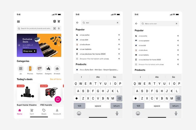
Depending on what the user searches for, the results present a robust search experience that returns accurate and relevant search results.
Users see the most relevant products at the top of their search results, using factors like keyword match, popularity, ratings, and "user behavior.”
Advanced search features like “Did you mean?” or “Related Searches” also help users in places where the search query does not provide the desired results or products they are looking for.
The goal is not to return an empty search result to users, as in the third screen.
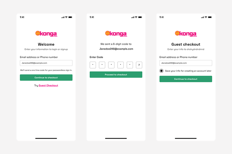
As the first step to simplifying the checkout process and reducing the abandonment rate, I designed a straightforward login and signup process.
Almost 18.75% of abandonment rates on e-commerce sites are due to strict password rules, and from my research, this was a pain point that users continuously emphasized.
To mitigate against this, I designed a solution that offers users the option of using a magic link or guest checkout.
I carried out this research as a personal project. There’s no perfect product, as humans will evolve and technologies advance. To read the full case study, click here
