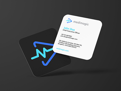
MediMagic - Case Study
Brand Identity for MediMagic - World's First 3D Medical Learning Platform
An e-learning app established in India, MediMagic provides learning opportunities for medical students as well as medical professionals aspiring to further their knowledge via informative 3D videos. After finding some success, MediMagic believed it was time to rebrand itself in such a manner that its new brand identity was more attuned to its vision and mission.
Research & Planning
Since MediMagic already had a logo, I decided it would be fair to borrow elements from the existing logo rather than design one from scratch. The previous logo consisted of elements like a cardiogram, a play sign, and a heart, which were sufficient to inspire me to revise the logo and go with a rebrand.
About the Symbol
Designed to spark interest upon first sight, the logomark has been fabricated with an electrocardiogram (shaped like an M) protruding from a play sign, alluding to the mission of MediMagic of videos for medical students. The brand name appears at the right of the logomark, completing the logo.
Color Palette
I chose Aqua, Azure, Grey, and Charcoal for the color palette, as these are eye-popping colors that can incite interest in the students using the application.
Typography
Sofia Pro is a font that comes with a range of weights and styles, making it easy to adapt to various communication mediums. As such, I decided to choose this font for the typography of the logo.
Iconography
In addition to the logo, this project entailed the creation of custom iconography, an endeavor I thoroughly enjoyed. I created these icons in the same manner that I had designed the logo. These icons could be utilized in the app’s functionality and navigation and were made with the same color palette to align with the overall brand identity.
Motion Graphics: Eliyas Mohamed
Role:
— Logo Redesign
— Visual Identity System
— Collateral Design
— Brand Guidelines
Got an interesting project in mind?


