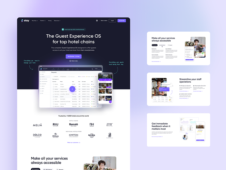
New homepage for Stay
Hey there 👋!
I'm thrilled to share the brand new homepage design for Stay, a holistic Guest Experience OS that is revolutionizing the way hotels interact with their guests. By taking a people-centric approach, this design embodies a seamless and intuitive user interface that prioritizes the guest's experience.
Check it live: https://www.stay-app.com/
The design is an embodiment of modernity and clarity, reflecting Stay's commitment to creating intuitive, innovative, and interactive solutions for the hotel industry. This fresh perspective enhances the Stay platform by making it easier than ever for guests to access hotel services right from their smartphones.
The layout is defined by its clean lines, crisp typography, and a well-thought color palette, contributing to an overall aesthetic that is as inviting as it is practical. It efficiently navigates the fine line between being visually engaging and maintaining an uncomplicated user interface.
As guests navigate through the homepage, they'll find everything they need at their fingertips, from room services, spa bookings, to concierge assistance and local recommendations.
In this project, I've utilized the Nucleo Icons library—a comprehensive collection known for its modern and clear icons. These icons played a pivotal role in the design, significantly contributing to the interface's simplicity, clarity, and elegance.
A key aspect of this project was the integration of responsive design, ensuring an optimal viewing and interaction experience across a variety of devices.
I'm eager to hear your thoughts and feedback on this design. Let's continue to elevate the digital guest experience together!
Don't hesitate to reach out and tell me about your UX/UI challenges.


