Gym App Redesign
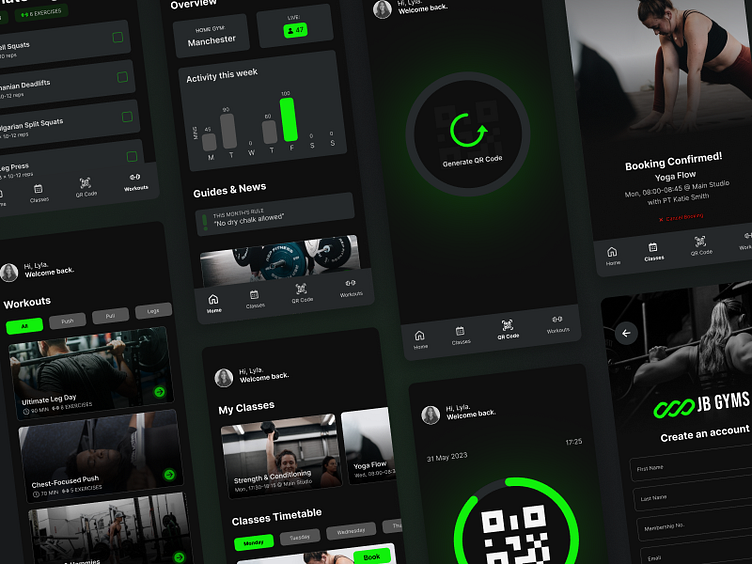
Hi Dribbble! I wanted to share this design concept for a gym app I redesigned.
I used this app for the gym I currently go to. Here are some of the problems I found as a user:
-I was only using the app for the purpose of generating a QR code to get into the gym and it seemed wasteful for an app.
-The UI was outdated and there was a lot of room for improvement. When I think of the gym, I think dark colours/theme, bright neon lights, and a lively environment, the app didn't reflect that.
For this project, I decided to opt for a dark-theme app with dark greys and the brand's bright neon green.
The added features on the home page includes:
-Being able to see how many people are currently at the gym which is useful to avoid peak times
-Weekly activity times
-A statement for the local gym's rule of the month
-Guides & News to browse through during your workout etc.
What do you think?
If you like this, please press "L" and/or leave your feedback.


