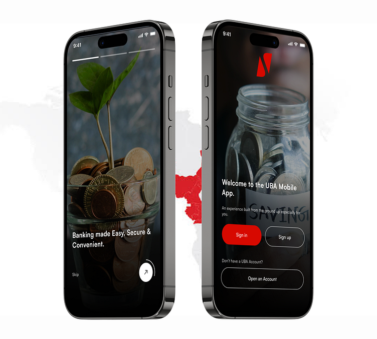
UBA Mobile App Onboarding Re-design
INTRODUCTION
UBA is a prominent financial institution with a mobile banking app that allows customers to access a wide range of banking services conveniently. The onboarding screen is the initial point of interaction for new users when they install the app. It plays a crucial role in shaping their first impression and determining their willingness to continue using the app.
Challenges:
1. The existing onboarding screen might not effectively engage and captivate new users, potentially leading to a high dropout rate during the initial onboarding process.
2. It lacks intuitive design elements and fail to provide a seamless experience, resulting in user frustration and dissatisfaction.
3. Branding and Communication: The onboarding screen presents an opportunity to showcase the bank's brand identity, values, and key offerings. If not optimised, it may not effectively communicate these important aspects to users.
BENEFITS
1. Enhanced User Engagement: By revamping the onboarding screen, UBA can introduce visually appealing elements, interactive features, and clear instructions to engage users right from the start. This can increase their interest and motivation to complete the onboarding process.
2. Streamlined Onboarding Process: By improving the UX of the onboarding screen, UBA can ensure a smooth and intuitive user journey. This includes reducing unnecessary steps, providing helpful tooltips, and implementing user-friendly interface elements. These improvements will help users easily understand and complete the onboarding process, leading to higher adoption rates.
3. Brand Building: The onboarding screen can serve as an opportunity to reinforce UBA's brand identity and values. Through thoughtful design choices, UBA can create a visually consistent and memorable experience aligned with its brand. This will enhance brand recognition, trust, and user loyalty.
A more realistic onboarding with images and what the bank app has to offer while also having a modern look to it would make it more appealing to its users and also a sense of control and familiarity with its users.


