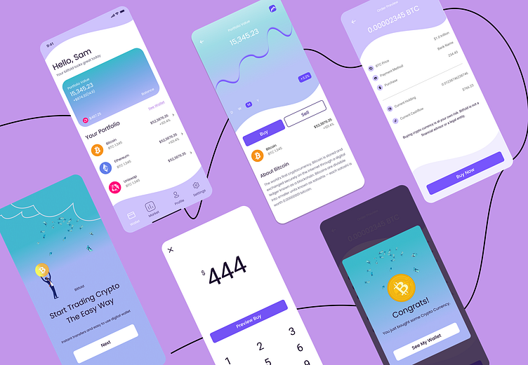
Case Study: UI Design for Cryptocurrency App
Timeline: 2 weeks | Dribbble Product Design Capstone Project | Tools: Figma
Project Overview
Create a simplified cryptocurrency application, Bitfold.
Create less steps to get to trading with simple, easy to understand statistics.
Make trading cryptocurrency easy to understand, friendly, fun, and hands-off.
Problem
Cryptocurrency is confusing and intimidating.
Solution
Design an app that is easy to understand, fun to use, and approachable for all.
A mobile app is the easiest, most accessible and approachable avenue for adoption.
My Role
UI Design
Branding
My role was to design the UI for Bitfold based on past research and a previously existing user flow and wireframes provided by Dribbble for one of our final capstone projects.
Past Research
We have had interviews and surveys with our target demographic and are very confident that we are reaching a specific demo that is in need of this app. We also have great competitive sets like Robinhood and Public as examples of simplified investment technology.
Persona
User Flow
This flow solves the persona's problem because it makes buying and selling simple and easy, rather than difficult and intimidating.
The user can browse different cryptocurrencies in their dashboard/wallet. Once they select a currency they want to learn more about, they can either buy, sell, or return to the dashboard.
The coin home shows statistics and news articles so the user can feel well educated about the currency before they make their purchase.
Wireframes
Style Guide
UI Components
Design iterations
Drafted various designs to come up with the final color palette and layout.
It's raining crypto!
I came up with an idea to illustrate clouds with money and cryptocurrencies falling from the sky to add a sense of fun and playfulness and instill in the user that if they use this app, abundance will come their way.
Final design
Soft, curved lines, bright colors, and gradients make buying and selling cryptocurrency a fun, friendly, and easy experience.


