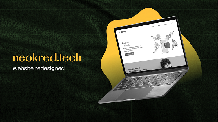
Neokred SaaS Website UI Design Revamp
Let me tell you about this rad project I did for Neokred Technologies Pvt. Ltd. Seriously, they're like the bee's knees, one of the absolute best companies I've had the pleasure of working with!
btw! It's almost a year old project (Oct 2022), 🙃to be frank I was lazy to create the case-study and upload.
Font guidelines are like my design soulmates. They're the one and only way to guarantee that your designs are rockin' consistent typography! Trust me, it's like having a personal stylist for your text.
Before diving into a project, I make it a point to whip up some killer color palettes. Trust me, if I don't, my fellow developers will start shedding tears just at the sight of my inconsistent designs. Gotta keep those coding comrades happy, you know?
Check out these cool little Icons I've slapped onto my designs! Some of 'em I snatched from IconScout, but others I had to whip up myself 'cause finding icons for fin-tech stuff is like searching for a unicorn in a haystack. Can you believe it? LOL!
Where are the Wireframes, and UX?
You're probably wondering if I'm the kind of dude who dives right into UI without a second thought. Well, think again! I actually took the time to conduct some serious UX research for this project, and let me tell you, my findings are locked up tighter than a secret recipe. If you're curious about my process, just shoot me a "Hi" on LinkedIn and we'll chat!
Just making things short and clean!
If you wish to know more about me and my designs, you are just one click away! 👉 website 👈


