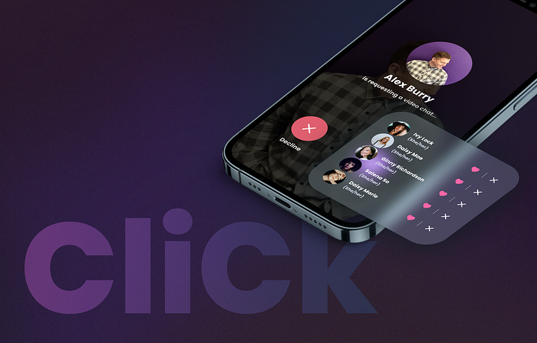
CliCk Social - Dark Aesthetic
CliCk Social but in a different light.
We love how the app design turned out, but we sometimes wonder how it would've looked like in dark mode... There's just that different energy to it, you know?
We thought we'd get some of the darker screens together and make a stunning presentation for you!
You can see more of the app screens on a previous post here on Dribbble.
Which one would you prefer light mode or dark mode?
... Pst, I think I prefer light mode. It's more energetic and fun!
More about CliCk Social
CliCk Social’s aim was to create a unique user experience. CliCk Social Inc. wanted to really stand out from the crowd in dating apps.
The app has interactive features to personalise profiles and give users multiple ways to communicate with matches: chat, phone calls, video calls and a go-live feature that randomly connects you with other users by video.
Consent is very important to us. When you GO LIVE, you can choose if you accept or decline a potential date after a pop-up shows their photos and basic info.
CliCk Social is available on the App Store and Play Store (Canada and US)
Like what you see?
Don't hesitate to contact us! We have more designs on Dribbble and Instagram so feel free to check them out!
Email: contact@freshplay.co.uk
Instagram: @freshplayuk
LinkedIn: Fresh Play LTD
FP Team x


