Product Packaging Design for Khandsari
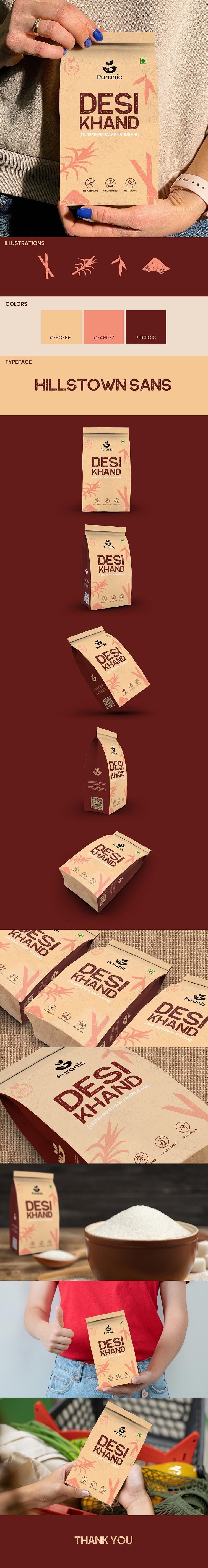
Brand Name: Desi Khand
The packaging design we have created is not only visually appealing but also practical and efficient. One of the key features of the design is its scalability, which allows for easy adaptation to variations in SKU (Stock Keeping Unit) requirements.
This means that the packaging can be adapted and customized to suit different product variations or sizes, without the need for a complete redesign of the packaging. This scalability feature saves time and resources while ensuring consistency in branding and packaging design across different product variations.
In addition to its scalability, the packaging design is also user-friendly and functional, with easy-to-read text and clear product information displayed prominently. The design incorporates a cohesive color scheme and font style that is consistent across all variations, allowing for easy recognition of the brand and its products.
Overall, our packaging design strikes a balance between form and function, providing a visually appealing and scalable design that is practical and efficient for product adaptation and customization.
ILLUSTRATIONS
The raw illustrations of sugarcane, sugarcane with leaf, sugarcane leaf, and sugar are a perfect representation of the Puranic brand's focus on natural and wholesome products, specifically their Unrefined Raw Khandsari. These illustrations beautifully capture the essence of the raw ingredients used in the production of Unrefined Raw Khandsari.
The first illustration features sugarcane, the key ingredient in Unrefined Raw Khandsari. The sugarcane is drawn with a rough and textured appearance that conveys a sense of rawness and naturalness. This illustration serves as a reminder that Unrefined Raw Khandsari is made from natural ingredients that are minimally processed, giving it a unique and authentic taste.
The second illustration features sugarcane with leaf, which further emphasizes the natural and organic nature of the product. The addition of the leaf adds a touch of freshness and vitality to the design, while also creating a sense of movement and energy that is visually pleasing.
The third illustration features sugarcane leaf, another key ingredient in the production of Unrefined Raw Khandsari. This illustration is simple yet elegant, with a focus on the intricate details of the leaf. It serves as a reminder that the product is made from natural and healthy ingredients that are carefully selected and minimally processed.
The fourth illustration features sugar, the end result of the sugarcane processing used to create Unrefined Raw Khandsari. This illustration is clean and polished, with a smooth and refined appearance that contrasts with the rawness of the other illustrations. It serves as a reminder that even though the product is made from natural ingredients, it is still refined to create a high-quality end product.
Overall, these illustrations perfectly capture the essence of the Puranic brand and their Unrefined Raw Khandsari. They are beautifully crafted and create a visually appealing and cohesive design that is sure to catch the eye of potential customers looking for a natural and unrefined alternative to traditional sugar.
COLORS
The use of colors in the Puranic packaging design plays an important role in creating a cohesive and visually appealing product. The main background color used is #FBCE99, which is a light shade of orange that gives the packaging a warm and welcoming feel. The use of this color creates a sense of playfulness and positivity that is perfect for the brand.
The #FBCE99 background color is complemented by the use of #FA9577, which is a brighter and more vibrant shade of orange. This color is used for the text on the packaging, creating a bold and eye-catching contrast against the lighter background. The use of this color for the text also ensures that it is easily readable and stands out, making it easy for customers to identify the product.
To add depth and dimension to the overall design, a darker shade of #FA9577 is used for the illustration on the packaging. This color choice adds a sense of richness and complexity to the design, while also tying in with the brighter shade used for the text.
Overall, the combination of these colors creates a harmonious and visually appealing packaging design that is perfectly suited for the Puranic brand. The use of warm and playful shades of orange conveys a sense of friendliness and approachability, while the bold and eye-catching contrast between the background and text ensures that the product stands out on the shelf.
TYPEFACE (HILLSTOWN SANS)
The Hillstown Sans font is a versatile and dynamic typeface that was chosen for the Puranic Brands Desi Khand packaging design. This font was specifically chosen for its ability to convey a sense of rawness, which is a key attribute of the product.
The font has a strong and confident presence that immediately captures the attention of the viewer. Its bold and clean lines exude a sense of strength and resilience, which is perfect for representing a product that is wholesome and natural. The sans-serif style of the font also adds to its sense of modernity, giving it a contemporary edge that is perfect for a brand that wants to be seen as innovative and forward-thinking.
Another important feature of the Hillstown Sans font that makes it perfect for the Puranic Brands Desi Khand packaging design is its round corners. The roundness of the font is perfect for representing a sweet product, as it adds a softness and warmth to the overall design. It gives the product a sense of comfort and familiarity that is sure to resonate with consumers.
The font is also highly legible, which is essential for a product label. Its clear and easily readable style ensures that the brand name and other important information are easily recognizable to consumers, even from a distance. This is essential for a product that is competing in a crowded market, as it needs to stand out from the competition and catch the attention of potential customers.
In summary, the Hillstown Sans font was chosen for the Puranic Brands Desi Khand packaging design because of its ability to convey a sense of rawness and its round corners that are perfect for representing a sweet product. Its legibility and modernity make it the perfect font for a brand that wants to be seen as innovative and forward-thinking, while its bold and clean lines ensure that it has a strong and confident presence that captures the attention of viewers. Overall, the Hillstown Sans font is the perfect choice for a brand that wants to stand out from the competition and create a strong visual identity that resonates with consumers.
Packaging design is the bridge that connects your brand's vision with your customers' hearts. Our designs are meticulously crafted to bridge this gap, creating an emotional connection and building brand loyalty. Trust us to create packaging designs that not only captivate but also foster long-lasting relationships with your customers.
Drop us an email at sales@pixenite.com 📩
We value your perspective! Share your thoughts in the comments section and spread the love by hitting the 'L' button to show your support.
