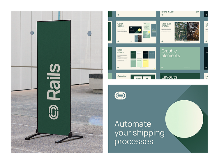
Rails Branding, Pt. 02
Hi again! Here’s another shot of the Rails' brand design. Rails is a command center for shipping related billing and compliance operations.
———
The task
Our task was to create a brand from scratch. They didn’t have a name or a clear idea on how the brand should look like.
———
The solution
The idea for Rails’ brand design is based around transportation and logistics. The symbol in the logo is a graphic representation of a railway track, while the dots and gradient lines used in the brand identity symbolize getting from point A to point B. As Rails helps with all shipping related matters by simplifying these complicated procedures, the gradient graphic elements depict the route of a package in the simplest way possible.
———
Psst! Want some designs? Drop us a line at hello@tonik.com


