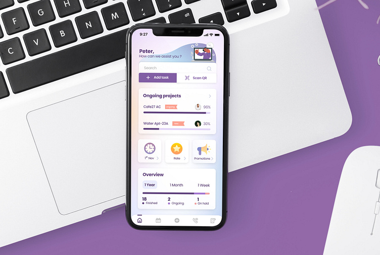
Assist - UI for the homepage
Assist team was looking for a designer to give a fresh interpretation to their existing mobile application. My task was to redesign the existing elements in the homepage while incorporating brand-colors. They were looking for a 'funky' and a colorful design. Main feedback they had from the users was that the current mobile screen is to plain and it lacks colour and character. They had feedback from the customers saying that the app looked too retro and old. So the team specifically asked for a more modern design with animations included.
Therefore my idea was to incorporate more colorful elements and use 3D icons to add character and a 'young' vibe to it. Floating icons were used on top of a gradient to give more depth and a slight parallax effect.
This design was approved and we were able to move to the next phase of the project!
