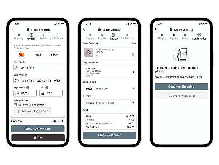
Daily UI 002 - Credit Card Checkout
Showcasing my checkout form design, meticulously crafted to enhance the user's purchasing journey!
Let's dive into its key elements and functionalities.
A progress bar is prominently displayed, guiding users through the checkout process step by step, offering transparency and clarity. Users can effortlessly track their progress, eliminating any ambiguity and providing a sense of control.
Accepted payment types are showcased with the logos of renowned card providers, instilling trust and confidence in the users. The inclusion of these logos simplifies the selection process, allowing users to choose their preferred payment method swiftly.
The checkout form intelligently highlights the cost of the product or service being purchased, ensuring users have a clear understanding of the financial commitment they are making. This transparency fosters trust and minimizes any surprises along the way.
Furthermore, the design optimizes user engagement through captivating visuals, harmonious color schemes, and thoughtfully chosen typography. The layout promotes ease of use, emphasizing intuitive placement of input fields, buttons, and important information.
This checkout form design exemplifies the fusion of functionality and aesthetics, elevating the user experience to new heights. It empowers users to effortlessly complete their purchases while instilling a sense of confidence and satisfaction.
