Daily UI 001 - Sign Up
A user-friendly sign-up page design! I have prioritized simplicity and ease of use to ensure a seamless registration process for the users.
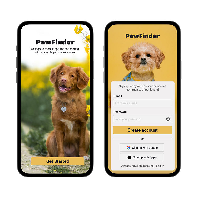
The sign-up page features clean and intuitive input forms that are designed to make filling out information a breeze. The forms are equipped with helpful placeholders, providing guidance to users about the type of information required in each field. This ensures that users can quickly and accurately enter their details without any confusion.
To enhance usability, I have implemented clear visual hierarchy for the buttons on the sign-up page. The primary call-to-action button, such as "Get Started" and "Create Account," stand out prominently, attracting the user's attention. This visual prominence is achieved through a combination of design elements such as size, color, and positioning, making it easy for users to identify the next step in the registration process.
In addition to the traditional sign-up options, I have included the convenience of signing up with Google or Apple accounts. By integrating these popular third-party authentication methods, I provide the users with alternative and simplified registration options. Users can choose to connect their existing Google or Apple accounts, saving them time and effort by eliminating the need to manually fill out registration forms.
Overall, the sign-up page design prioritizes user experience by focusing on simplicity, guidance, and convenience. By combining easy-to-use input forms, clear button design with visual hierarchy, and the option to sign up with Google or Apple accounts, I aim to streamline the registration process and create a positive first impression for our users.
